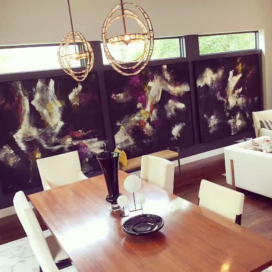
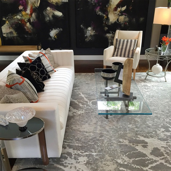
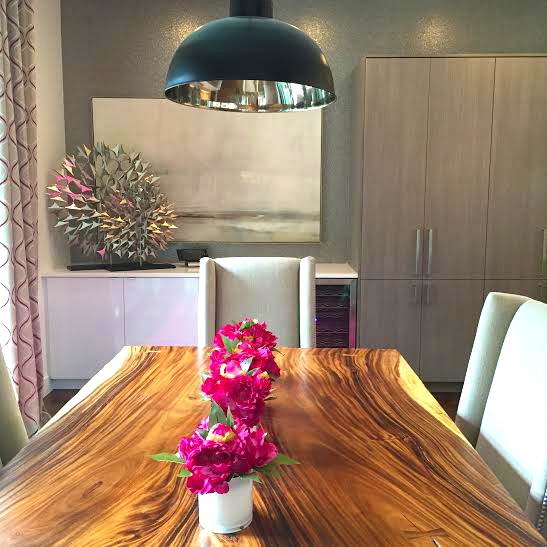
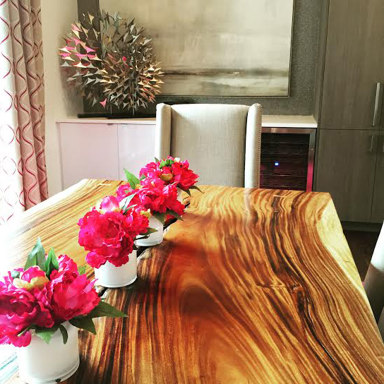
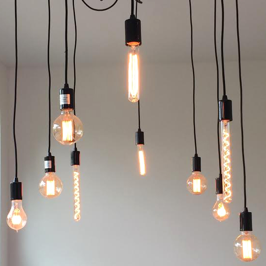
Just inside the front door, you find yourself in the open concept dining and living room designed by Castles Interiors. The first thing I noticed were those gorgeous light fixtures above the dining table!!
It’s not often that I have the chance to go inside a house with high, thin windows like the ones I have throughout my house, so I was excited to see how the designers used the expansive wall space below the windows. While I am a huge fan of the giant modern art that they chose, the anal, symmetry loving part of my brain is a bit bothered by the fact that the paintings on the left and right are not centered below the windows. However, the dark paint color behind the paintings helps to disguise this fact.
I always love the combination of dark grey walls with white furniture, so the living room is singing my tune!
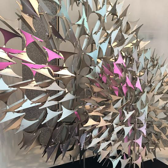
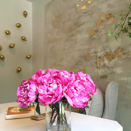
The modern, metal sculptures on the counter behind the kitchen table reflect the pink flowers and rug, giving this art even more interest and dimension.
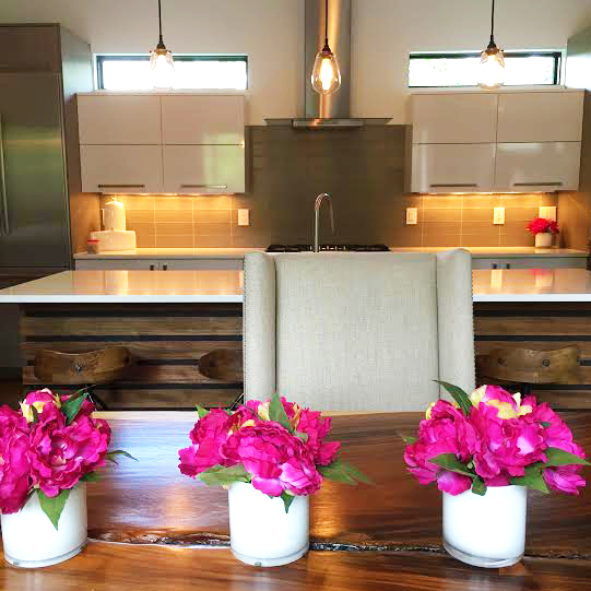
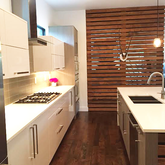
The thin windows above the cabinets bring a lovely glow of the light to the kitchen.
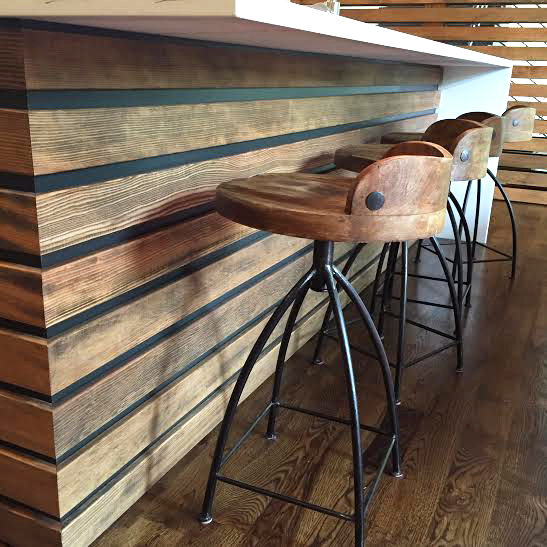
I was so excited to see the finish on the kitchen island, because it’s exactly what I’ve been envisioning for my own kitchen island. And now that I’ve seen it executed so beautifully, I am even more excited about doing it in my home!
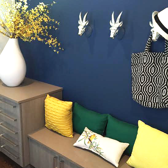
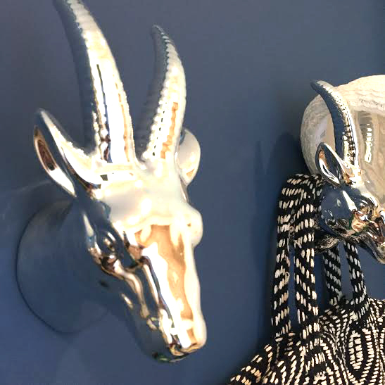
And how fun are those hooks?
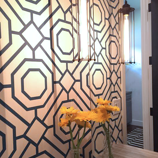
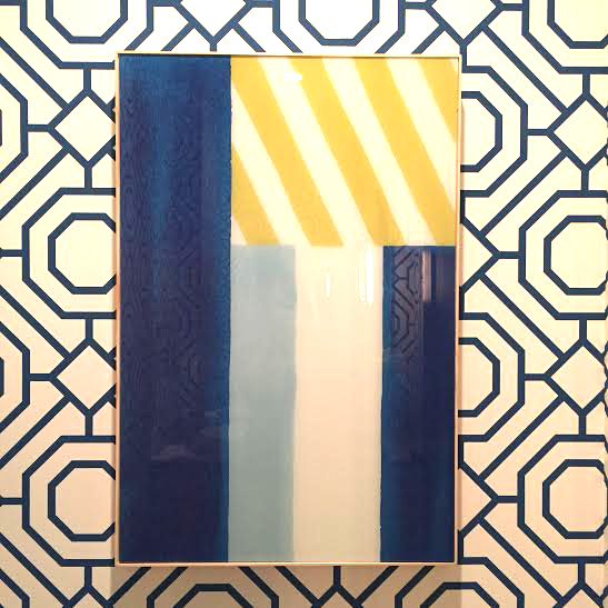
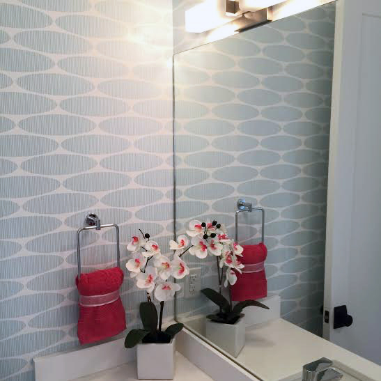
Off of the mudroom is a powder room, also designed by AK Interior Design. This was a hard space to photograph because of it’s small size, but these two photos capture all of my favorite elements of the space – starting with the graphic wallpaper! I love the industrial light fixture that hangs in front of the mirror, as well as the modern art above the toilet.
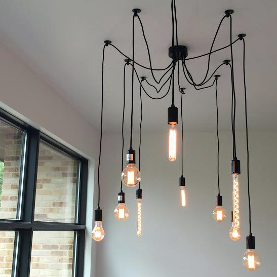
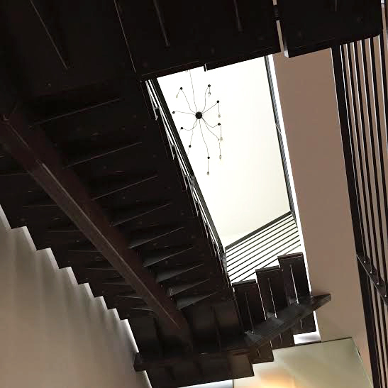
Heading up the stairs, you can’t help but stop to admire this chandelier!
Who knew there were so many different styles of industrial light bulbs?! I’m sure I would have major sticker shock if I knew the price of this light fixture, but man would it look good hanging in my two-story entry way!!
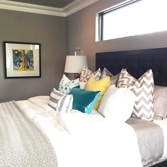
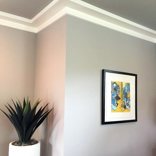
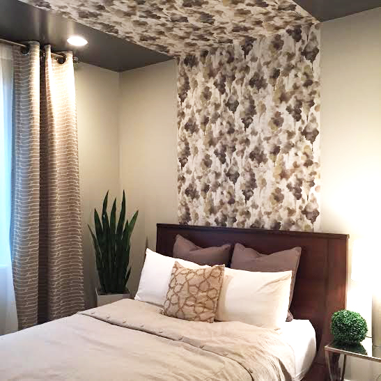
My favorite detail in this bedroom is the molding around the ceiling. This simple addition creates the look of a modern tray ceiling, and could easily be added to just about any room to create instant architectural interest!
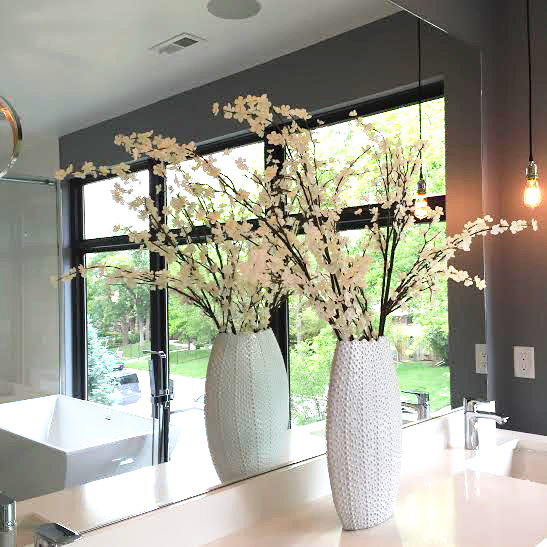
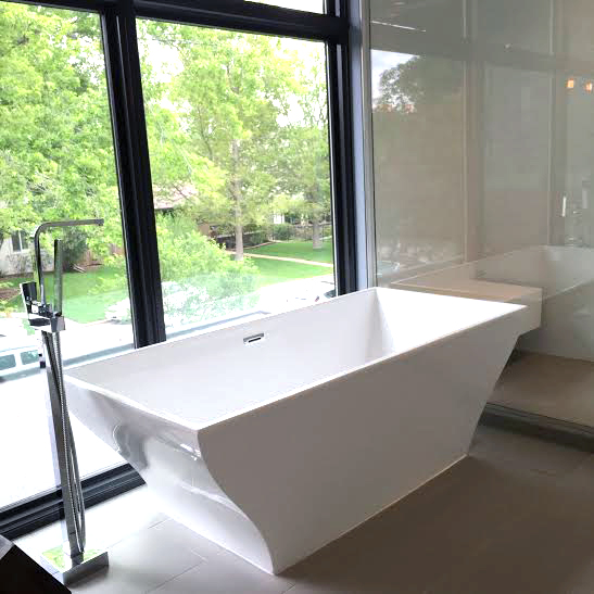
The master bathroom is beautifully light filled…
…and talk about a bathtub with a view! Of course, since this bathroom looks out over the street, the future owners will certainly have to come up with an effective window covering solution!
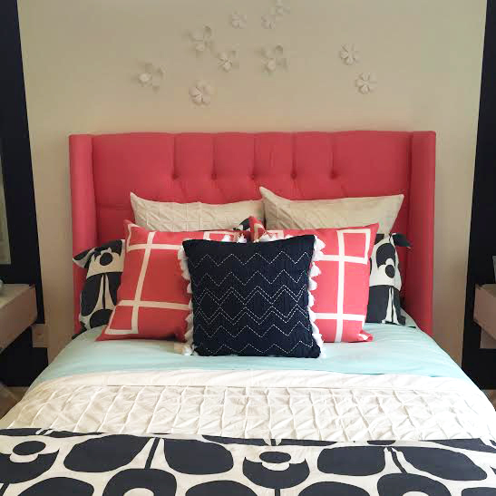
My favorite design element in the girl’s room is definitely the wallpaper in the en suite bathroom!
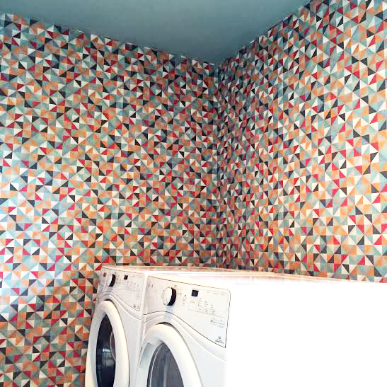
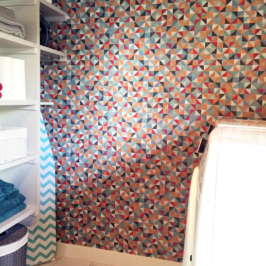
The spacious laundry room, designed by Addison Design, is awash in this busy pattern, but I assure you that feels {a little} less overwhelming in person than it does in these photos. It’s a bold choice, but it a laundry room is a perfect place to make a design statement that might be too much for another room in your home…but even then, this might be too bold. I do think, however, that if the designer asked my opinion, I would hang some photos or art in white frames with wide, white mats to help break up all the pattern on the walls and give your eye a place to land.
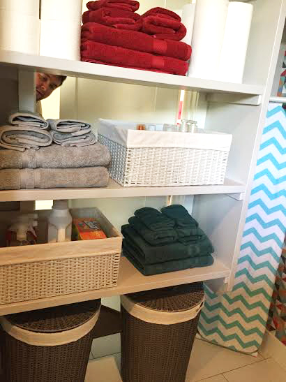
…but then I did a double take and realized that there is a door on the other side of those laundry room shelves, creating a pass through linen closet that is accessible from the hallway. Talk about convenient!
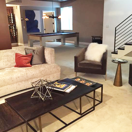
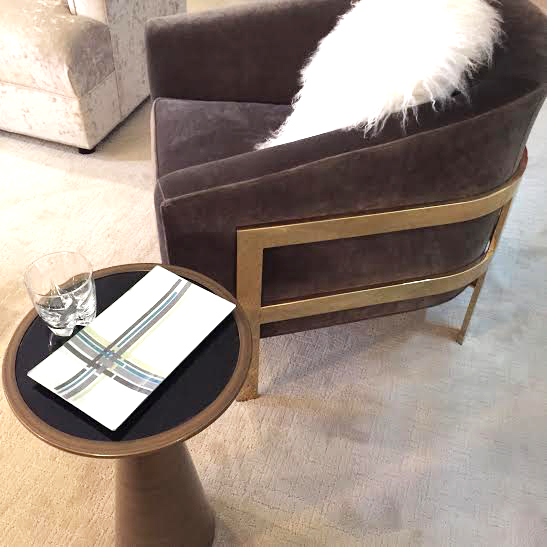
Check out these fantastic club chairs with the gold frames and fuzzy, fur pillows!
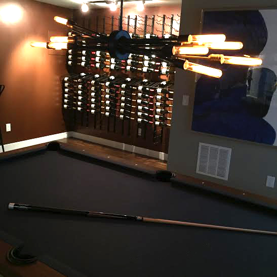
This house is full of fabulously industrial light fixtures, and this one above the pool table is another great example!
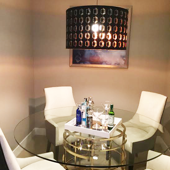
Tucked into a small nook on the other side of the basement is a stylish game table. While the table fits quite tightly, the glass top maintains a spacious feel and it’s a very effective use of space!

