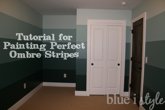
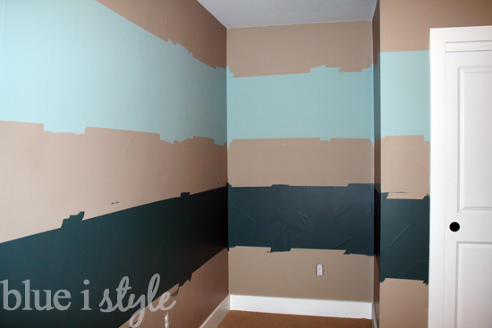
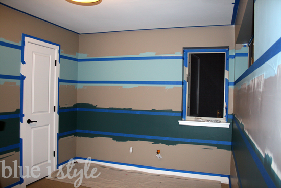
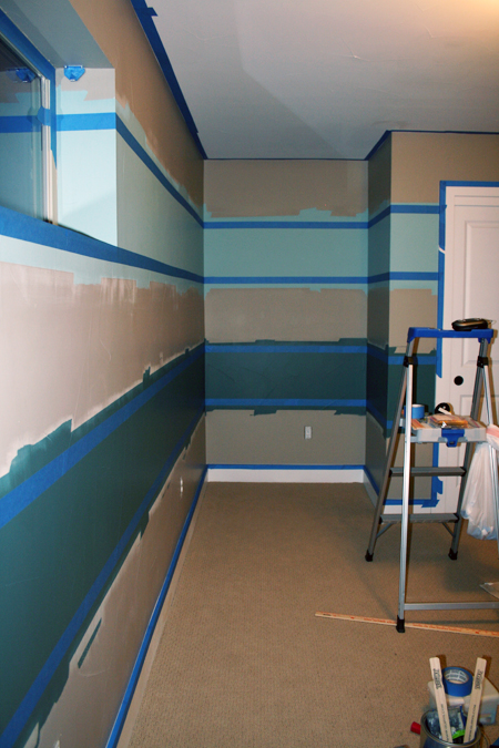
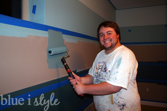
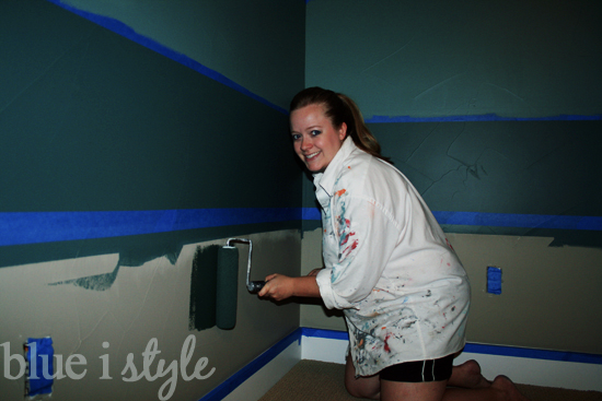
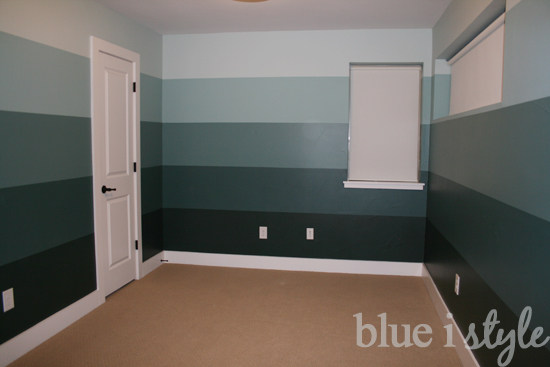
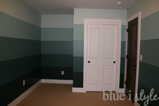
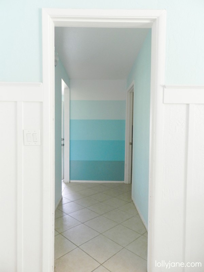
As I told you in my first nursery blog post, I decided to go bold and paint our nursery with ombre inspired stripes that graduate in color – from dark at the floor, to light at the ceiling – so that in the end, the effect would be similar to that of a paint sample strip. Click here to read about our color selection process.
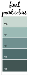
These were the five Benjamin Moore colors we ended up selecting (which may appear different depending on your screen settings). For those who love the details, the colors are Benjamin Moore’s White Rain (708), Kensington Green (710), Fort Pierce Green (712), Polished Slate (713), and Hidden Falls (714).
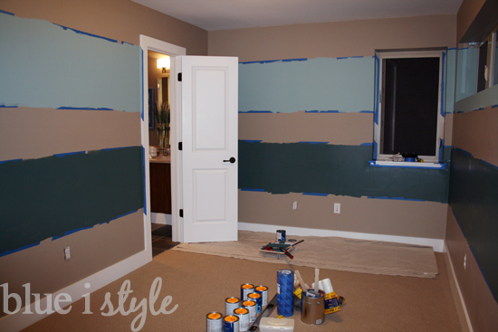
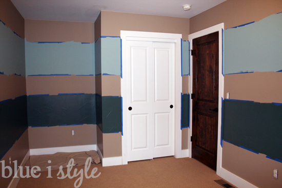
Of course, the idea seemed brilliant in my head, but when it came time to actually get down to painting, I started to get nervous. I’d painted stripes before, but only in the context of painting one color of stripe over an existing color. Painting five different colored stripes…this was a different kind of challenge. My husband and I sat down and hashed out our different ideas for how to best tackle the project in search of a plan that would ensure the crispest lines with the least amount of measuring and taping. Finally we agreed on a plan – and I am proud to say that while it was time consuming, it was very manageable and the results were exactly what we had hoped for.
Here’s my tutorial on painting ombre stripes…
(1) Assembling all the Necessary Tools:
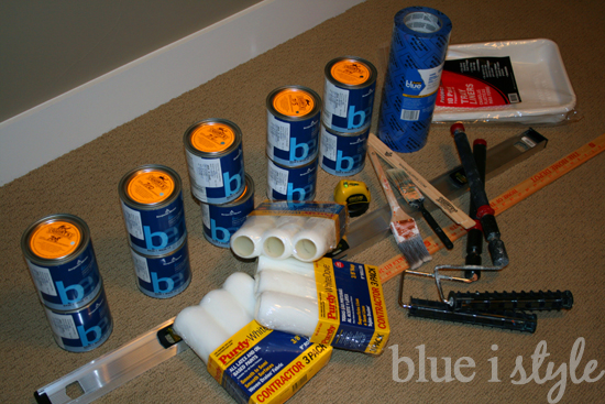
- Paint: Based on the size of our room, we determined we would need between one and two quarts of each of our five colors – so we bought two quarts of each to ensure that we wouldn’t run out mid-project and would have touch up paint for the future. We chose an eggshell finish, as it’s easier to clean than a flat paint, but shows fewer flaws and is generally more attractive than a gloss or semi-gloss paint.
- Paint Rollers: Extendable rollers are a must for us short people (the ones we have are called Twist and Reach). The Purdy brand roller covers are more expensive than others, but I’ve done enough wall painting to know that a good quality roller can make all the difference, and these have been working well for me.
- Painters Tape: We’ve always used 3M Blue Painters Tape and and we’ve always gotten good results.
- Faux Glaze: This is the key to achieving crisp lines with little or no touch up required. We use the Behr brand of faux glaze. After taping, apply a liberal amount of faux glaze with a brush, half on the tape and half on the wall. The glaze creates a seal so that no paint will bleed under the tape, and if any glaze bleeds under the tape it dries clear and is unnoticeable. Note that this is also a good way to seal along the ceiling and at the baseboards – not just when painting stripes.
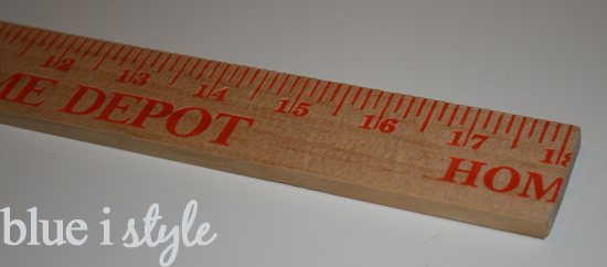
- Level, Laser Level and Yardstick: We used all three of these in combination to ensure our lines were straight and our stripes evenly spaced. The laser level we own is a Strait-Line brand from Home Depot – it works great and is light weight enough to be temporarily mounted to the wall with a 3M command strip allowing for hands free use. Rather than using the yardstick we already owned, we bought a new one for about $1 at Home Depot and cut it down to the exact measurement of our stripes. More about that as we move along.
(2) Measuring, Taping and Painting Stripes 2 and 4
We measured the total height of the wall and divided by five to determine that each stripe should be 181/8” wide, then we cut down our yardstick to exactly that measurement.
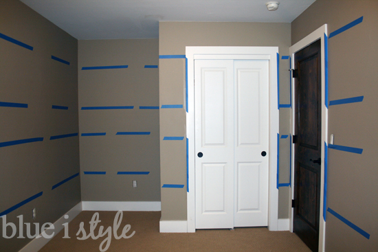
With the approximate measuring and taping completed, the walls looked like this:
Tip 1 – Selecting Colors: It’s easiest to pick your paint colors all from one paint strip. While it can be tempting to pick your dark, mid and light colors from different strips – this can be a risky move. The colors may look like they blend well together based on small paint samples, but when painted on the walls in large quantities, you run the risk that the different undertones of the colors may clash – especially as the light in the room changes throughout the day. At the other end of the spectrum, don’t try to create your own paint shades by starting with one dark color and adding white to create the lighter shades. Unless you are painting a small accent space, you not only chance running out and having to mix more (in which case you’ll never get a perfect match), it will also create major headaches if and when you need to touch up the paint in the future.
Tip 2 – Dark at the Bottom, Light at the Top: For a balanced look – start with the darkest color at the bottom and work up to the lightest color at the top. This will make the room feel grounded and the space feel open. Particularly in a room with a white ceiling (as is most often the case) – by painting the lightest stripe at the top of the room, it will appear as though the colors continue to fade all the way up into the ceiling, creating a feeling of greater height. For an even cozier feel, you could paint the ceiling in the same color as the lightest stripe, or you could paint the ceiling one shade lighter than the top stripe. On the other hand, if you were to paint the darkest color at the top of the room, with the lightest color at the bottom, the room would likely end up feeling very heavy and unbalanced, creating the effect of closing the space in around you.
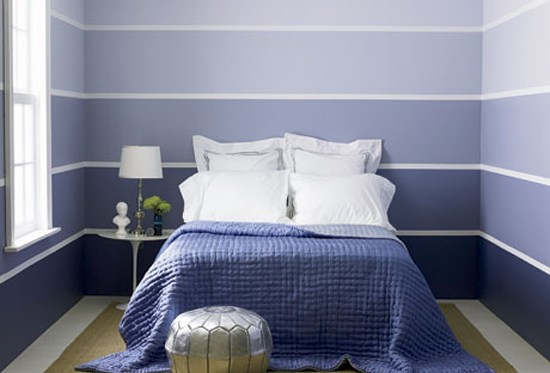
Tip 3 – Width of Stripes: Not all of the stripes have to be the same width. While we opted to keep our stripes uniform, you could instead have the darkest stripe be the widest, and have each successively lighter stripe be a bit narrower than the one below it, like this:
Or if you are really brave, you could blend the colors into one another rather than having crisp lines between each – and if you come up with a great way to achieve this look in a consistent manner, I’d love to hear about it!
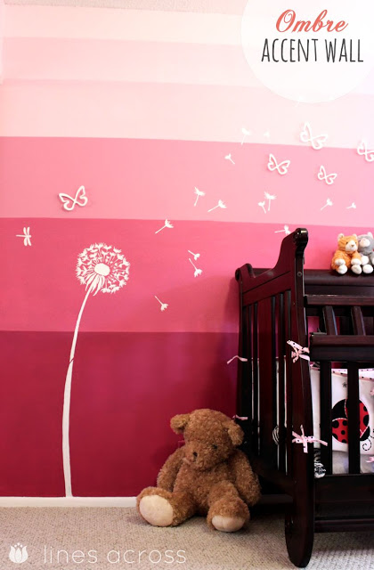
Tip 4 – Alternatives to Painting the Whole Room: If the idea of painting the entire room in ombre stripes overwhelms you, or just isn’t for you – try just one small accent wall and chose one of the mid to light shades for the remaining walls.
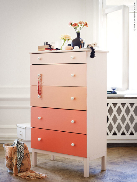
If the idea of wall stripes is too much for you – consider the graduated stripe approach on the drawers of a dresser by painting each drawer front in a lighter shade than the one below it.
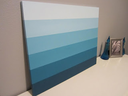
Have you added any ombre to your home? I’d love to see your projects!
Update: Check out these links for all of the posts about the nursery…
Linked up at Remodelaholic
