A lot of people’s idea of a vacation is a tropical destination relaxing on a beach, but Scott and I are more wired for city lights. So when we decided to take a Babymoon before the arrival of baby number two, we decided to head to one of our favorite places – New York City. The trip was nonstop, including three Broadway shows in four days, art museums and sightseeing … But I couldn’t go to NYC and not take in some interior design inspiration.
In my last post, I talked about my visit to the CB2 store in SoHo, but I was still craving more. After some research, I learned that NYC’s Architects and Designers Building is filled with over 10 floors of designer showrooms that are all open to the public. BINGO! And lucky for me, Scott is always a good sport and was game to spend a morning at the A&D Building.
These showrooms, of course, featured endless gorgeous and VERY expensive furniture and fixtures, but rather than just showing you things that likely none of us can afford, I wanted to share with you some ideas that could be translated to our own homes. So, without further ado, a little New York City style inspiration.
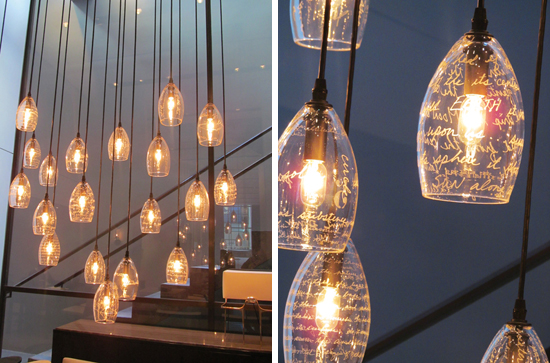
Let’s start with my favorite of all. From a distance this elegant light fixture from Holly Hunt appeared to be covered in etched writing, but up close the writing on the glass is actually gold.
It’s such a stunning effect, and would be easy to replicate on any glass light fixture with just a gold paint marker. The writing could be anything from a favorite quote or poem, to song lyrics, or even your wedding vows. Just be sure to use a paint marker made especially for glass, and follow any instructions on the package for baking in the oven to insure that the paint is properly cured.
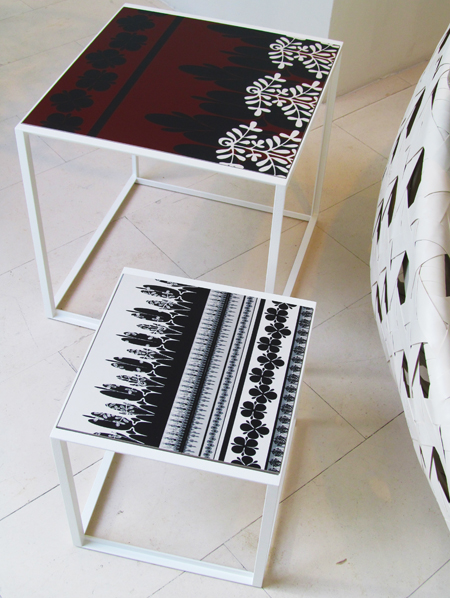
These outdoor Canasta tables from BB Italia feature intricately patterned stoneware tops. It would be easy to achieve this same look by using tile paint and a stencil to customize an inexpensive outdoor table with an inset tile top (outdoor tile tables are available at many stores, including Target). There are a variety of tile paints on the market, such as Liquitex Glossies. Be sure, again, to follow the instructions on the paint packaging for proper baking/heat setting of the paint. Because many tile paints do require heat setting, this would work best for a table with removable tiles, rather than one with tiles grouted in place. Additionally, textured tiles would be more difficult to paint, but for a table with removable tiles you could swap out the textured tiles for smooth tiles from your local tile store for very little cost.
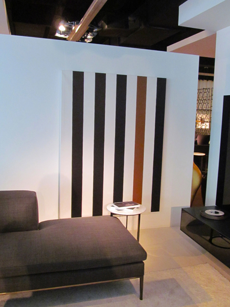
While we’re on the topic of painting, there were several large canvas paintings hung in the BB Italia showroom that could easily be replicated by anyone. I love bold stripes, so I was especially drawn to the black and white vertical stripes of this painting, but what really makes it pop is the one stripe in a contrasting color. This would be a great way to tie in an accent color, or to add an unexpected pop of color.
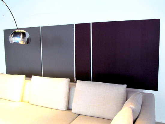
It’s a bit hard to tell in the photo, but this is actually a grouping of three canvases – a solid gray canvas on the left, a solid purple canvas on the right, and the middle canvas features a roughly painted white stripe separating color blocks of gray and purple. It can be difficult to get scale right when hanging artwork above a long couch, so using three canvases hung together is a great way to fill the horizontal space.
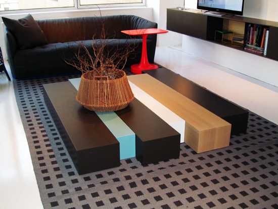
Here’s an interesting twist on a traditional coffee table. The Woodstock coffee table from Poliform is composed of chunky wood planks placed side by side and available in a variety of wood tones and mat and lacquered colors. I like it’s modern, low profile, but it’s price tag is … well, I don’t know what the price tag actually is, but it’s expensive enough that you have to submit a price request if you even want to find out. But this concept could be easily replicated on a budget with a trip to Home Depot or Lowe’s and your choice of paint and stain colors.
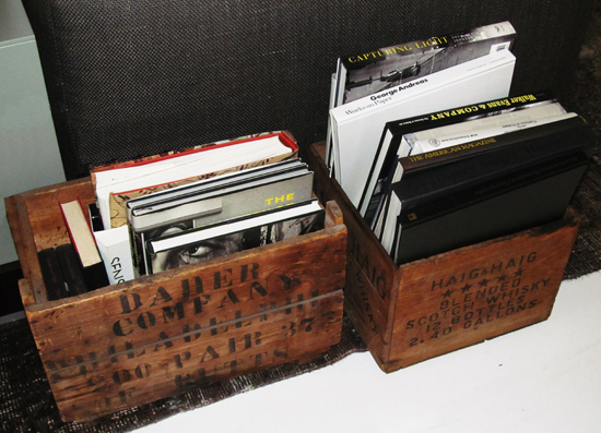
Here’s a very simple idea for magazine or book storage. If you can’t find vintage crates that you like, you could easily purchase an unfinished wood crate and add some stain and stencil your own lettering with black acrylic paint. Finishing with a light sanding on the edges and over the stenciled letters would add the aged appearance.
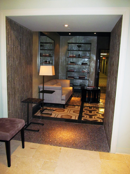
If you are looking to really dress up a passageway between rooms, take a look at these tiled walls. While the tile in this showroom was extremely pricey, this look would have just as much impact with affordable mosaic tile purchased from any local or online tile source. I particularly like the use of the long thin mosaics running vertically up the walls, which adds a sense height. The impact could be even greater if you continued the tile onto the ceiling.
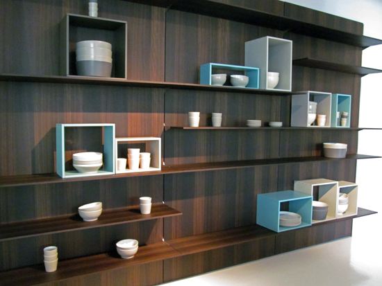
Open shelving in a kitchen can be a challenge! While it always looks great in model homes, in reality open shelves often look cluttered or disorganized. I love the idea of using painted open backed boxes to segregate and frame stacks of plates, cups, and bowls. What a great way to add pops of color and a sense of order, while making your dishware look like framed art.
I thoroughly enjoyed exploring the design showrooms of NYC’s Architects and Designers Building! Whenever I travel, I often also find inspiration in the designs of hotel lobbies and trendy restaurants – and this trip was no exception. So I’ll close with a couple of ideas direct from two of the restaurants where we dined.
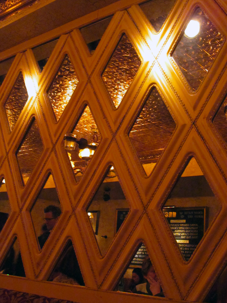
Check out this wall of framed mirrors, which I saw in Uncle Jack’s Steakhouse in Midtown Manhattan:
These diamond mirrors, installed above the chair rail on the upper half of the wall, provide a very formal look. While diamond shaped mirrors might be hard to find at a reasonable price, a similar look could be achieved with a wall of affordable square framed mirrors turned 45 degrees. Alternatively square or rectangular framed mirrors could be laid out in any number of tiled patterns. It might be even more cost effective to install one large mirror on the wall, and simply attach a series of abbutting frames to the front of the mirror to achieve the same look.
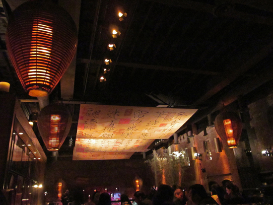
Finally, a little inspiration from a restaurant called Tao. When looking for a late night dinner after a show on Saturday night, we stumbled upon Tao, which was near our hotel. It was nearly midnight when we arrived, yet there was still an hour-long wait for a table – that’s when we knew it must be good. It was also immediately apparent that we might not be hip enough to hang with the crowd that was there. Nonetheless, we stuck around and managed to get a table in the bar without waiting too long. The design of the entire restaurant – which was originally a 19th century stable for the Vanderbilt family – was incredible, including a 16 foot tall Buddha that appeared to float above a reflecting pool of Japanese carp. What most inspired me, however, were the large painted panels suspended from the ceiling.
