This week, we are revisiting our design definitions, but this time each participating blogger is sharing before and after photos that illustrate how our design style has evolved and changed over time, and sharing tips on how to bring our unique styles into your home.
Welcome to My Home Style: Before and After Edition!
This post contains some affiliate links. If you buy something that I recommend, you pay the same price, but I may receive a small commission. I only recommend products that I really love and use myself!
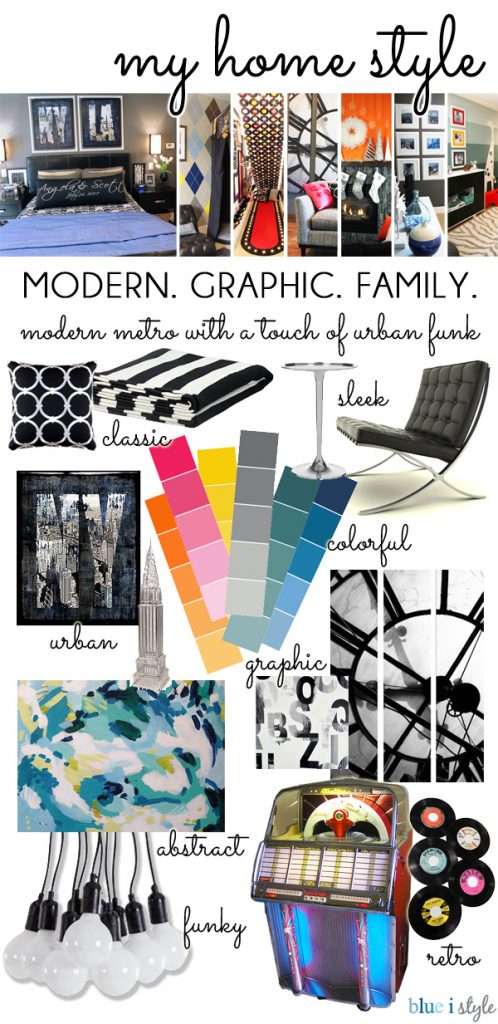
Let me start by show you what MODERN GRAPHIC FAMILY means to me, and how it looks in our home…
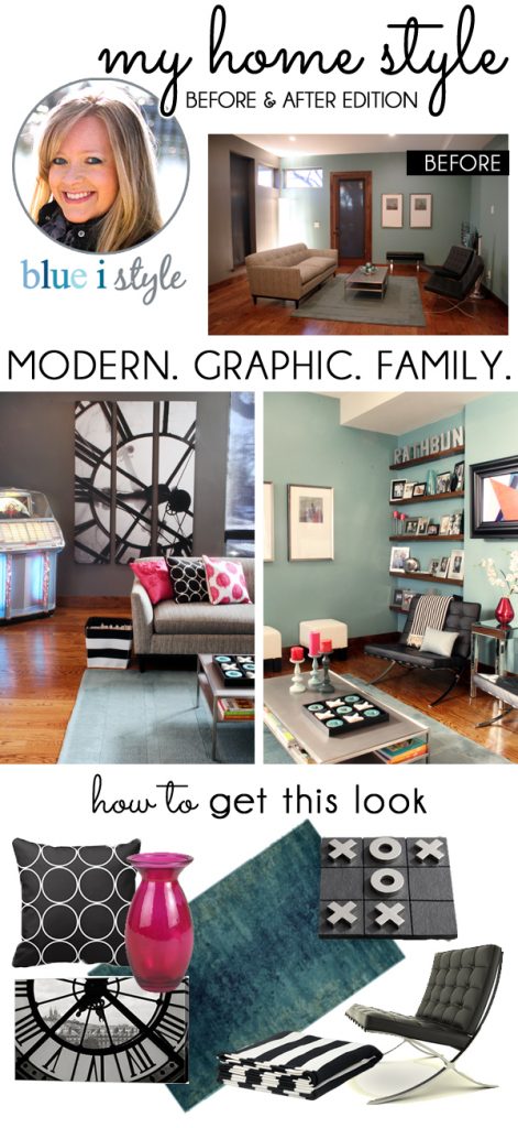
Before moving into our current home {back in 2008}, we lived in a small condo downtown, and we had barely enough furniture to fill a few rooms of the new house. Little by little, we saved our pennies and began furnishing the empty rooms. At that time, our style was well defined as “modern” and we did a good job of picking couches, chairs, and tables that I still love today. But in those early days, that is all we had. Each room was very stark, and desperately in need of more layers and more interest.
Take our living room for example. We had a couch with great mid-century lines, two classic barcelona chairs, and a metal coffee table. We hung two pieces of art on the wall that we received as wedding gifts… and that was it! It was modern, but it was boring!
Little by little over the years, we have been adding to the living room, and this is where the graphic elements of our decor have come together… a few bold pillows here, a giant black and white clock photo there.
Most recently, we’ve added a third layer to the style of this room. That’s where the “family” part of the design comes in. Of course, family is not a word that is typically associated with a design style, but we’ve put a specific emphasis on incorporating our two preschool age boys into every room of the house in a way that has added to and enhanced our style, rather than detracting from it.
In the living room, the tic tac toe board on the coffee table is one prime example, as well as the jukebox which results in many family dance parties and memories made. There are also bins of toys, a large lidded basket full of train tracks, a rocking horse, and a bouncing cow that call this room home. I also swapped out my collection of museum art books on the coffee table shelf for a growing collection of kids’ books about art. This allows me to share one of my interests with them in a totally hands-on manner.
Since a picture is worth a thousand words, let me show you an example of how our style has transformed from stark modern to MODERN GRAPHIC FAMILY.
Black & White Circles Pillow
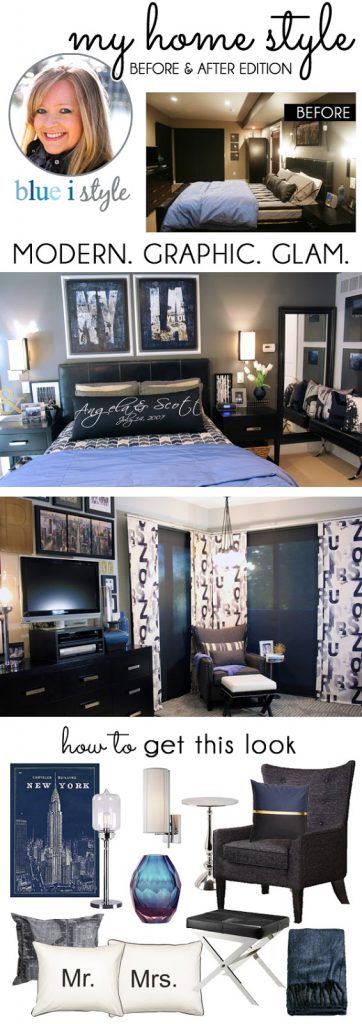
We want our boys to feel comfortable to have fun in every room of our house. No space is off limits to them. However, we also recognized that to be a well balanced family, and to be the best mom and dad we can be, we needed to dedicate some attention to our own space as well. Our master bedroom and bathroom were the last two rooms in the house to receive any real decor, and when we finally did turn our focus to those spaces in the past year, we did so with an emphasis on us creating a retreat where we could relax and recharge after long days of parenting.
Despite the boys being a welcome and frequent presence in our master suite, we designed the spaces with more focus on us, and less on them. Where the rest of our home is MODERN GRAPHIC FAMILY, these two spaces are probably better defined as MODERN GRAPHIC GLAM. Every mom deserves a little glam, right?!
SHOP THIS LOOK:
Black & White Circle Pendant
If you’d like to read more about the MODERN GRAPHIC FAMILY style of our home, you can hop over to my original post on this topic, which has many more examples of how we balance stylish living with kid life, and how the kids have actually pushed us to be much more bold in our design choices.
TUESDAY
WEDNESDAY
THURSDAY
FRIDAY


