UPDATE: Thanks for stopping by to see our entry and living room. The photos below are a couple of years old, so if you want to see some more updated photos of the living room, you’ll find them in these seasonal home tours:
It’s open house time again, so come on in and have a look around…
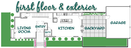
Today you don’t have to go far past the front door, as I’m giving you a tour of our open entry and living room. Here’s a reminder of the first floor layout to help you get your bearings. And in case you missed them, you can take the tours of rest of the first floor {the kitchen and powder room}, as well as the entire second floor tour.
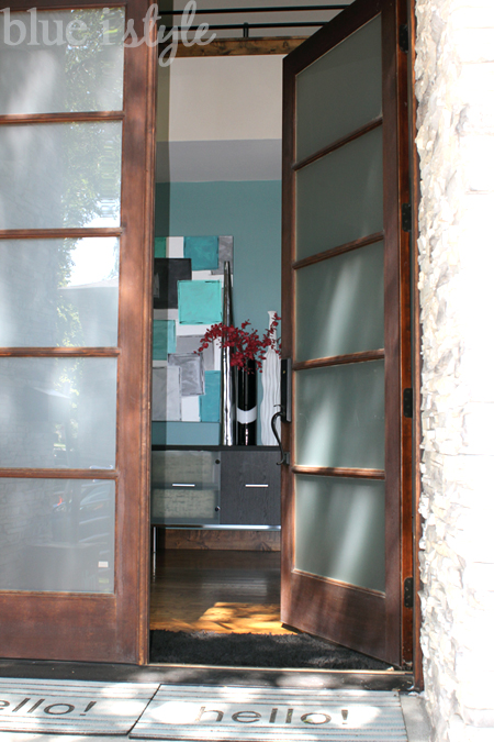
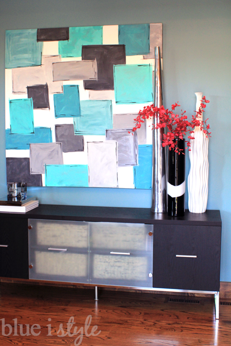
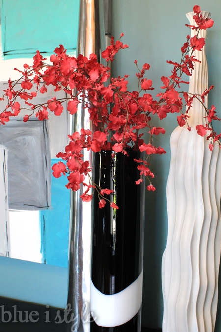
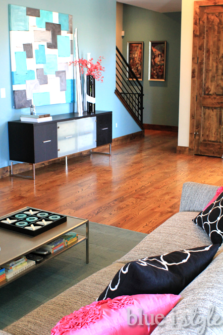
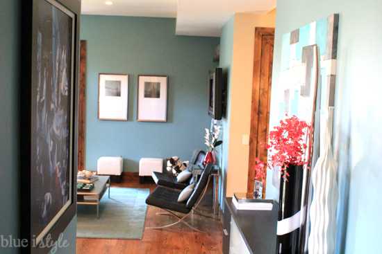
As soon as you step through the front door, you’ll see a long entry table directly in front of you.
The painting above the table was a quick and fast DIY job that I’ve never been a big fan of. I painted it one weekend when I couldn’t stand staring at the giant blank wall any longer, but I never intended it to be the permanent solution – just a stop gap measure. Four years later, I finally have a plan for redoing this painting. I’m guessing I won’t get around to repainting it until after the holiday season, but when it finally happens, I’ll be sure to share it with you.
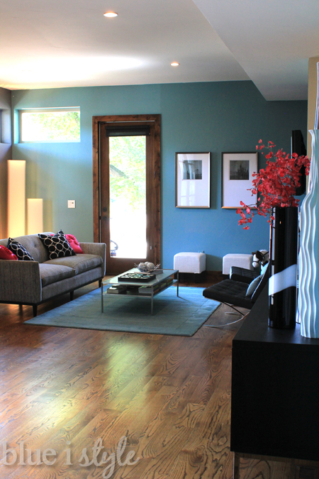
Turning to your left, you see the living room.
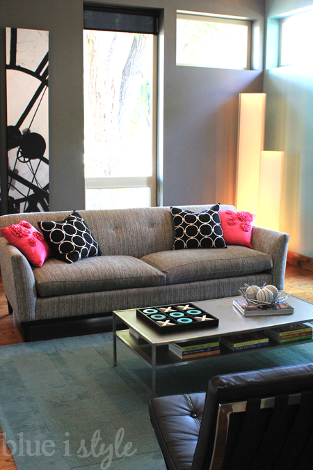
The walls are the same two colors of teal and grey as the kitchen, but rather than royal blue accents, the living room features bright pops of pink.
Like the rest of the house, the living room has tall thin and long narrow windows.
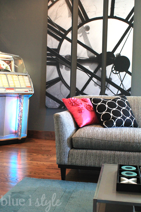
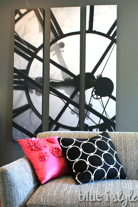
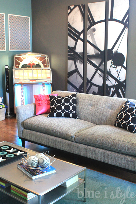
These windows are great modern architectural features, but they can create decorating challenges. After struggling to find art of a large enough scale to fill the wall to the left of the window, we did what we often do and went the DIY route. The giant triptych on the wall behind the couch is a photo that Scott and took from the top of the D&F Clock Tower in downtown Denver.
The city hosts an annual event called Doors Open Denver, which provides access to areas that are generally not open to the public. A few years ago, during Doors Open Denver, Scott and I took a tour of the top of the D&F Clock Tower, which allowed us a view of the inside of the giant clocks and their inner workings. The picture that hangs on the living room wall is actually a color photograph taken from inside the clock tower, it just appears black and white because the light shining through the clock face was so bright. Because the photo is of the back of the clock face, you’ll also notice that the numbers appear to be in reverse order.
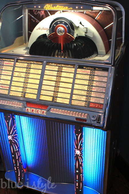
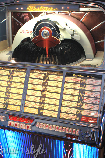
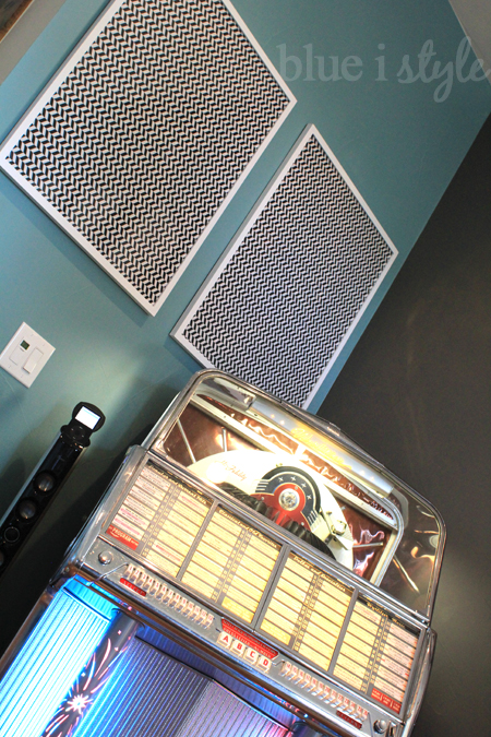
In the front corner of the living room sits a restored, 1955 Wurlitzer jukebox, which was a Christmas gift from my parents a few years back.
This is the definitely one of our boys’ favorite spots in the whole house, and it’s the site of our daily dance parties.
Since the boys often request songs that we don’t have on record, we also have an iPod speaker that stands next to the jukebox, giving us the best of both worlds.
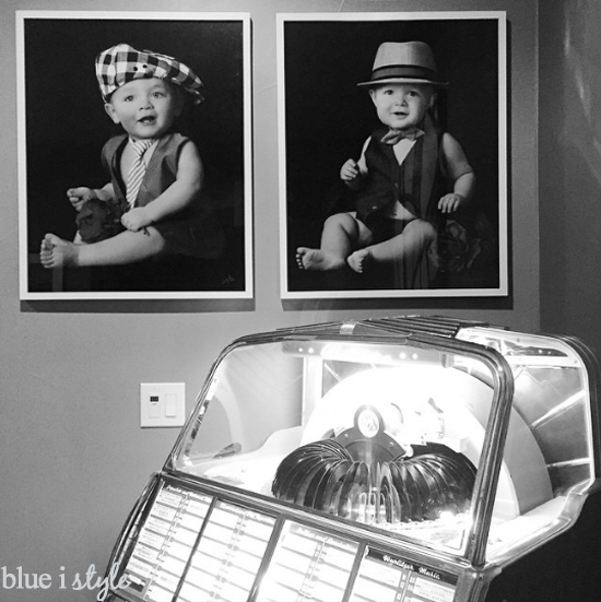
The frames above the jukebox will soon be filled with both of our boys’ one year photos – we are just waiting for the photographer to print Cooper’s photo {and they borrowed Beckett’s photo to match the coloring}. UPDATE: How cute are these matching one year old photos above the jukebox?!
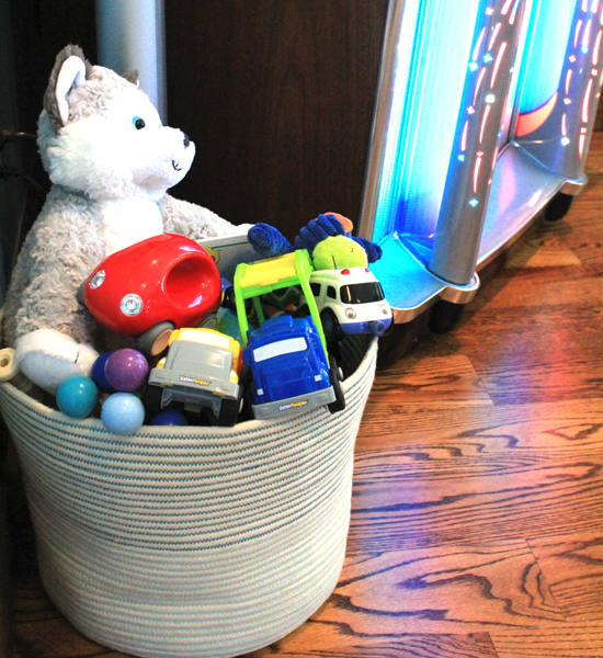
Although we spend much of our family time in the basement, where the boys have a large play area, I like to keep a small basket of toys in the living room. This cute basket with teal stitching keeps the toys within easy reach for the kiddos, and makes clean up fast and easy for mom.
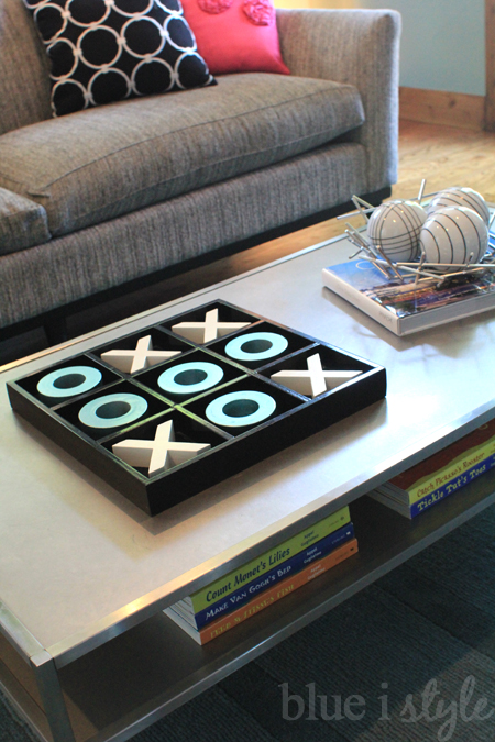
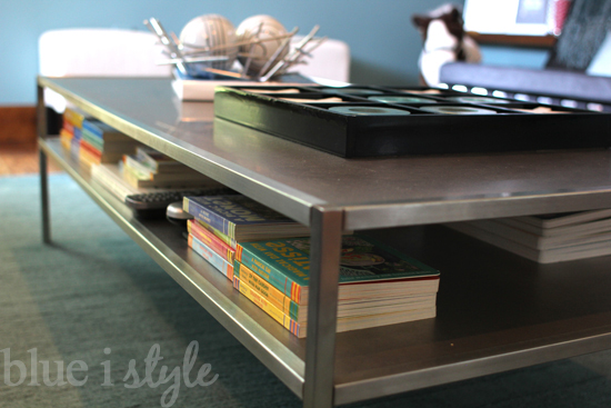
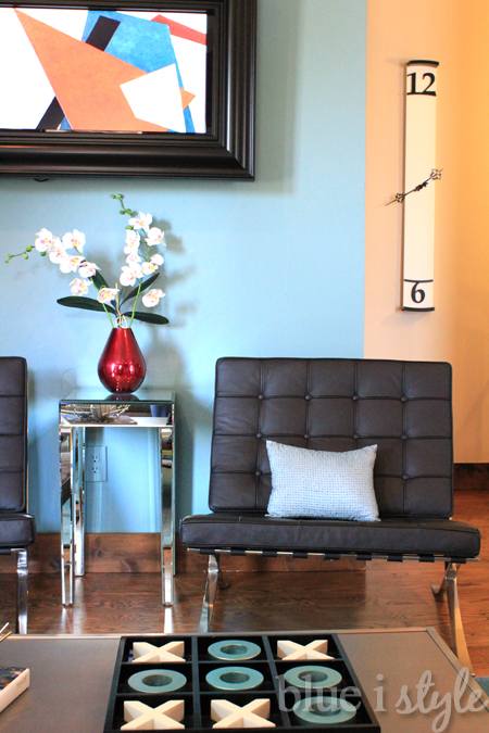
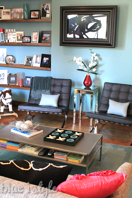
In order to make the living room kid friendly, I also keep the coffee table styling to a minimum. The giant tic tac toe game makes a fun family activity.
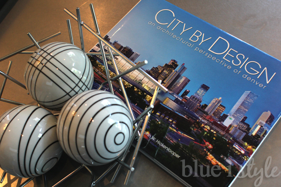
The only thing that remains on the coffee table that isn’t safe in little hand is a book about the art and architecture of Denver and a bowl of decorative balls. By keeping the non-kiddo coffee table styling to a minimum, it’s easy for me to move these two items to the entry table when the boys are playing in the living room.
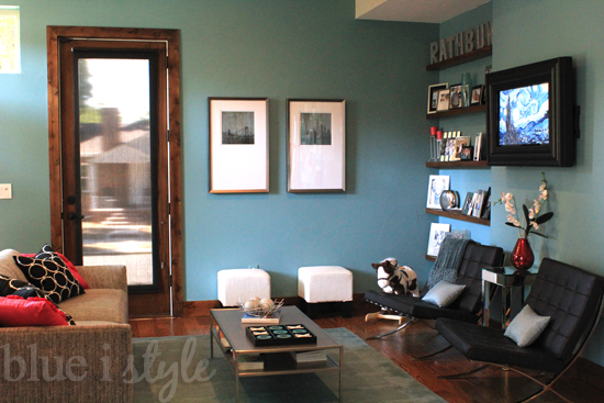
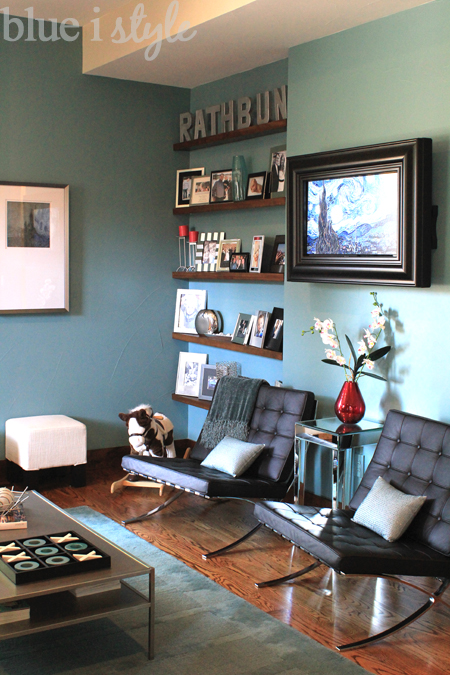
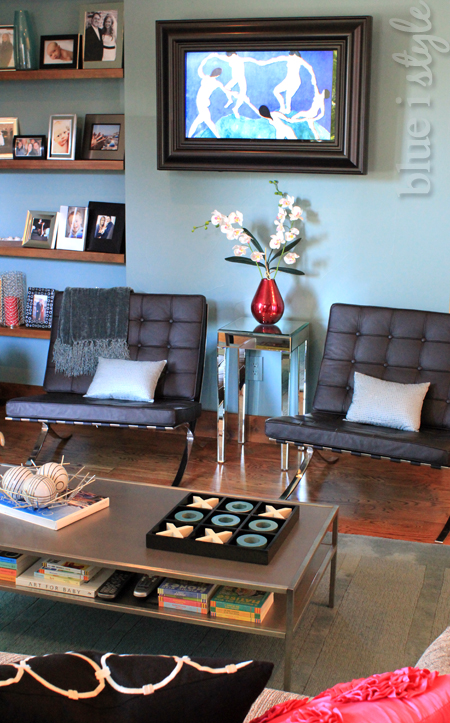
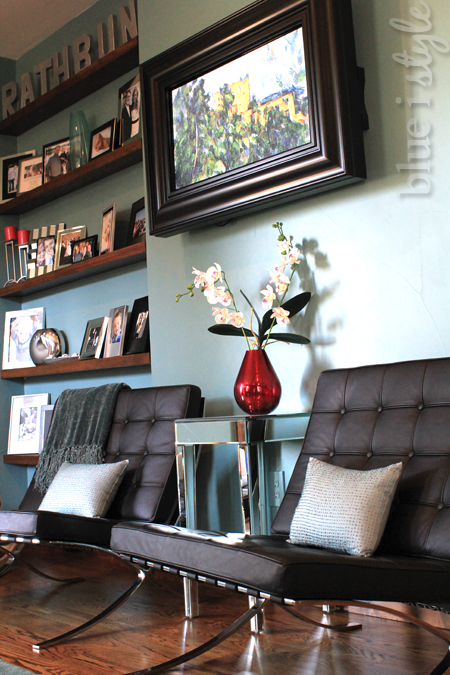
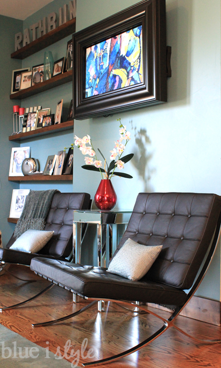
On the other side of the living room are two knock-off Barcelona chairs, with a framed television hanging above.
Although our main television watching space is in the basement family room, we wanted to have a TV on the main floor. The builder had pre-wired for a wall mounted TV, but since the location is visible as soon as you walk through the front door, I opted to purchase a frame for the television to make it seem like more of an intentional focal point and less like a large black eyesore.
The closet behind the television houses a DVD player, allowing me to turn our TV into a work of art.
I found a DVD that plays a slideshow of 50 of the most famous paintings from the Museum of Modern Art (MoMA) in New York City.
It’s always funny when we have guests over because they often don’t realize that it is a television within the frame.
All of the sudden, someone will do a double take and say, “Wait a minute! That’s not the painting that was hanging there a couple of minutes ago!”
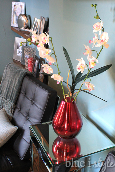
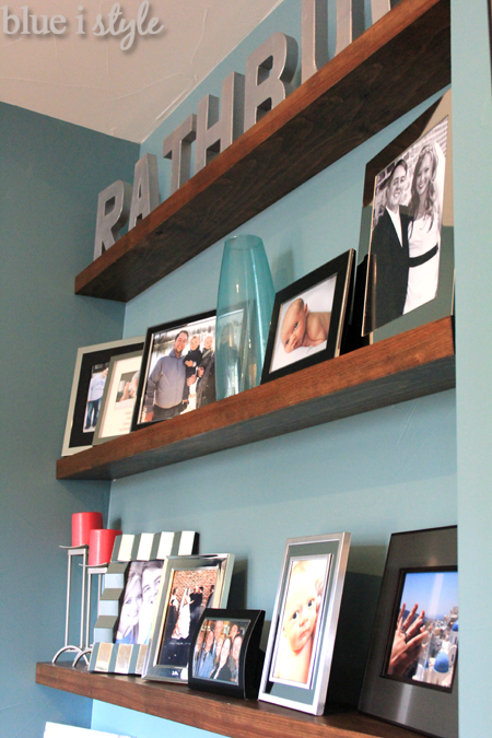
When we moved in to our home, the corner with the picture shelf frames was just an empty, awkward inset. The addition of the floating shelves was an easy and stylish alternative, and it has really allowed us to make the most of the space.
You can read all the details about the floating photo shelves in this post.
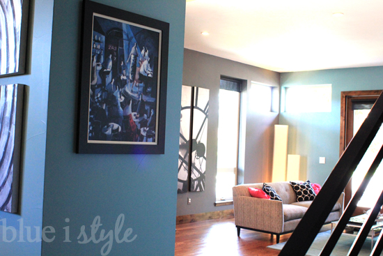
Here are a couple of last looks. This is the view from the living room, through the entry and toward the stairs {complete with baby gate}. In this photo, the kitchen is just around the corner to the right.
And here’s the view from the stairs back toward the living room.
Thanks for taking the tour! If you haven’t already, be sure to also take the full tour of the kitchen and main floor powder room.
I love our hot pink living room accents, but this year I am changing things up for fall. In three short weeks I’ll give you another tour of the kitchen and living room decked out in fall style!
