I think it’s a safe bet that most of you are familiar with Houzz – an online encyclopedia of gorgeous and inspirational home design photos. I’ve been browsing Houzz online and via my iPad app for a couple of years now, but it was just last week that it came to my attention that there is a separate app called Houzz Kids. Maybe I am late to the party and you all already know about Houzz Kids, but I was pretty excited to learn about it!
After browsing the app over the weekend, it seems that all of the room photos can also be found on the regular Houzz app, but the benefit of Houzz Kids is the ease of finding just what you are looking for. Via Houzz Kids you can browse room photos by age group (baby, toddler, 4-10, and teen). You can also browse a wide variety of products for kids by category under the “Gear” tab (bedding, chairs, toys, rugs, toy storage, etc.). Finally, and maybe most beneficial of all, is that every Ideabook on this app is specific to kids spaces. Since we are starting to plan a new room for Beckett, I specifically enjoyed reading some of the Ideabooks in the Toddler section, including “14 Bedrooms That Grow with Kids” and “Kid’s Rooms: I’m a Big Boy Now.”
I already had lots of ideas of for Beckett’s new room, but after spending a few hours on Houzz Kids this weekend, I found even more inspiration! Here are some of the rooms that I found particularly inspirational…
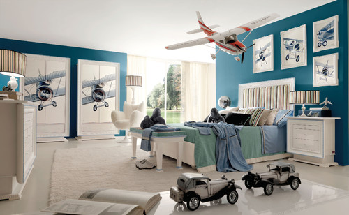
I love the blue and green combination of this room, and I love that the bedding is simple rather than the typical busy patterned kids bedding.
In this room, it’s the scale of the airplane art that really speaks to me. And the color – I can never get enough of that color.
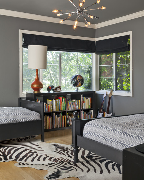
While I typically like brighter colors in kids rooms, I am really digging the idea of grey as a neutral for a boy’s room that can grow with him from toddler to elementary school. And one of the musts for Beckett’s new room will be lots of book storage!
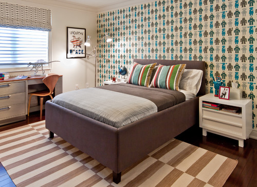
I like idea of one fun focal wall for Beckett’s new room, whether it be a painted feature wall or a patterned wall paper. I can’t believe I am actually considering wallpaper, but some of the options out there now are just so hard to resist.
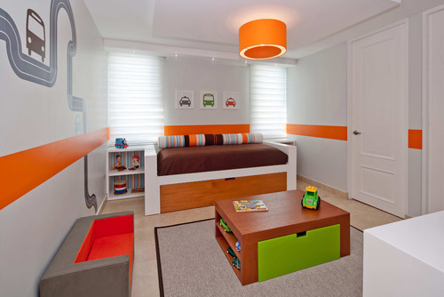
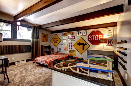
In this room, it’s more the function than the design that speaks to me. I like that the bed is up against one wall leaving the center of the room open for designated kid-sized seating and play spaces. I am considering a play table in the center of Beckett’s new room similar to the one in this room.
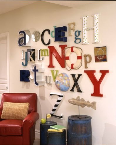
I love these alphabet walls, especially when some of the letters are tied to a particular theme, like the “O” in this grouping that is tied to a loose nautical theme. But since I am wanting Beckett’s room to grow with him from age 2 up through early elementary, I can’t decide if he’ll outgrow the alphabet wall sooner than that.
I think the road signs are a great addition to this room, and I love that there is a space dedicated to his car roads and ramps so that it doesn’t all have to be picked up and put away on a daily basis.
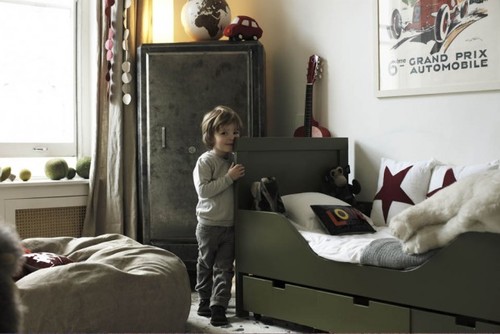
This is another of those neutral rooms that speaks to me because it still has plenty of fun elements that make it feel like a kids room, and not like an adult design being forced on a child. Since we’ll likely be leaving Beckett in a crib for a short time, and then converting it to a toddler bed, I’m happy to see how sophisticated the toddler bed can look in a well designed space.

