I’m flashing back to the early ’90’s with that C+C Music Factory reference, but it’s the best way I can describe today’s topic. I think we’ve all experienced those moments – when house hunting or living in our own homes – where you ask yourself what the architect and builder were thinking when they planned the space.
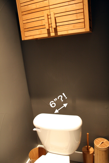
When they built our house, they plumbed the bathrooms assuming one size of toilet tank, but then installed toilets with much narrower tanks, resulting in a lovely 6 inch gap between the back of each toilet and the wall. A few years ago we had a plumbing issue in the basement bathroom that required installing a new toilet, so we were able to buy one that better fit the space. But in the rest of our bathrooms we can’t justify replacing perfectly good toilets, so we’ve learned to live with it and design around it. In the guest bathroom, for expample, we installed a bamboo cabinet above the toilet, the depth of which helps disguise the fact that the toilet sits far away from the wall. {See more of the guest bathroom here}
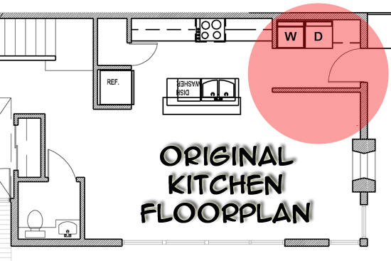
I have always LOVED looking at floor plans {and drawing them for that matter}, so when we found the blueprints and original floor plans for our house rolled up in the corner of a closet while moving in, I was so excited to see our house from that perspective! The floor plans revealed that some pretty major changes were made during the building process – changes that I am very happy about and that make it easier to overlook all those other little design flaws. The original floor plans anticipated that there was going to be a wall dividing our entryway from our living room, and that the washer and dryer were supposed to be in the kitchen. Here’s what the original kitchen floor plan looked like.
To say that I’m glad they moved the laundry to the second floor, rather than putting it in the kitchen as the original floor plans indicated, would be an understatement. In fact, the truth is that we likely wouldn’t have bought the house at all if the washer and dryer were located in the kitchen right inside the back door. Now, I realize that not everyone will agree with me, and that some people might like the idea of the laundry in the kitchen. Better Homes and Gardens even did an entire feature about the benefits of kitchen laundry areas. But it’s just not for me! Especially because our house is three stories, with the kids bedrooms on the second floor and our master bedroom on the third floor. I just can’t imagine hauling all of hubby’s and my laundry down two flights of stairs, and having clothes spread around our kitchen all the time.
In the actual layout of our house, the laundry area is located in a closet on the second floor, central to the kids rooms and right at the bottom of the stairs from our master bedroom. Having a laundry closet rather than a laundry room is not ideal, but I’m a glass half full kind of person and I much prefer it’s current location as compared to the kitchen alternative. {Click here to read about how we’ve made that laundry closet function like a room.}
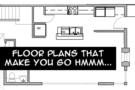
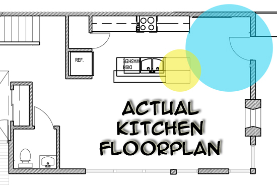
Thanks to the magic of Photoshop, here’s what the actual kitchen floorplan looks like:
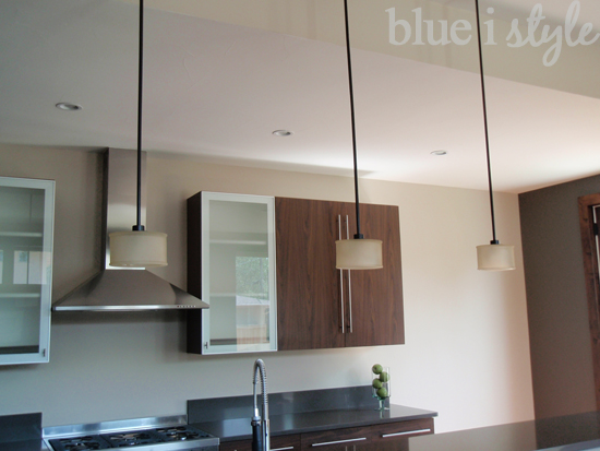
Finding the original floor plans answered one of the first questions that we asked ourselves when initially toured the house: Why is there so much unused space in the corner of the kitchen?! When the builder decided to eliminate the laundry area from the kitchen, they just left the space empty. And we’re not talking about a small space here – this left five and a half feet of unutilized real estate in the kitchen. Seriously, who couldn’t use five and a half feet of additional cabinet space?! This is what the resulting “hole” in the kitchen looked like when we first moved in (sorry for the poor quality, but we snapped these photos very quickly when touring the house for the first time).
While the removal of the washer and dryer from the floor plan left some pretty substantial dead space in the corner of the kitchen, it also allowed for some big improvements. As you can see in the modified floor plan, there is now no wall running parallel to the laundry area on the opposite side of the back door (which makes the kitchen feel much more open that it would have), and the removal of that wall allowed for an expansion of the kitchen island, which gives us a lot more counter and storage space. In this photo (also taken the first time we toured the house), you can really appreciate how much smaller the island would have been if it ended immediately to the left of the sink.
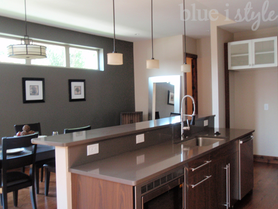 |
| The house was staged when we toured it the first time, so the furniture you see is not ours, nor was the house being lived in at the time the photo was taken (hence, no fridge). |
When we first bought the house, I was annoyed that the builder had chosen to leave so much unused space in the corner of the kitchen. But I quickly realized that rather than looking at this as a negative, I could instead view it as an opportunity! Look at all that space I had to work with!! Sure we could just add more upper and lower cabinets and continue the counter top all the way across … or we could get creative. And that’s just what we did. I’ll be back later this week to show you the plan we came up with!!
