Long before I was ever pregnant with our son, Beckett, I started imagining how I would someday want to decorate a nursery.
Now that baby number two is well on his or her way, I am very happy with that decision! The new baby will sleep in a cradle in our room for the first months, and then will move into the nursery when the time is right. This will allow us to create a new “big boy” room for Beckett down the hall, while keeping the nursery intact regardless of whether the stork brings us another boy or a girl.
I do have to admit, though, that it would be fun to have an excuse to design another nursery. But instead, I thought I’d embark on a series of blog posts to relive the nursery decorating process. (And soon enough I’ll start planning Beckett’s new room, and I’ll get to share that with you as well!) For this first nursery post, I will focus on the process of planning a gender neutral theme and selecting the color scheme.
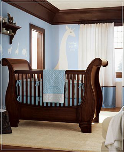
Years ago, I had torn this nursery picture out of a Pottery Barn catalog, and it had been in the back of my mind ever since.
While the furnishings of the room didn’t really suit my style, I really liked the use of the white animal silhouettes. I was inspired by the idea of an animal themed nursery in which white animals were contrasted against bold colors, creating a room that was a modern and simplistic take on the traditional zoo animal nursery theme.
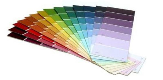
I love color (as will become evident as you see more of my home), and as long as I can remember, I have always lingered a little too long on the paint aisle of any home improvement store perusing the paint sample strips and dreaming up projects.
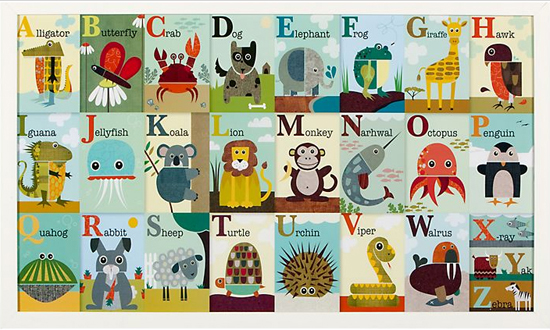
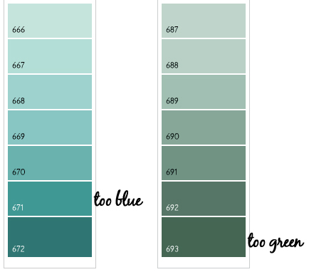
This got me thinking – why not mimic the ombre look of those paint strips by painting graduated stripes on the walls? If I were ever going to try it anywhere, the nursery seemed like the ideal space. Next was the question of color. I wanted to avoid the typical yellow and green gender neutral nursery concept (although I am loving the popular yellow and gray color combination). Then one day while shopping in Z Gallerie, I came across this fabulous framed alphabet art poster by Jen Ski.
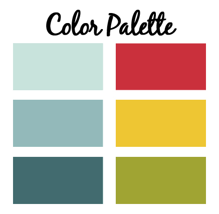
I was immediately drawn to all of the different shades of teal in background (not a stretch considering teal is one of my favorite colors and already prominently featured on the main floor of my home). I was also inspired by the contrasting colors in the poster – the red, greens and yellows. Just like that I had found my color palette for the future nursery.
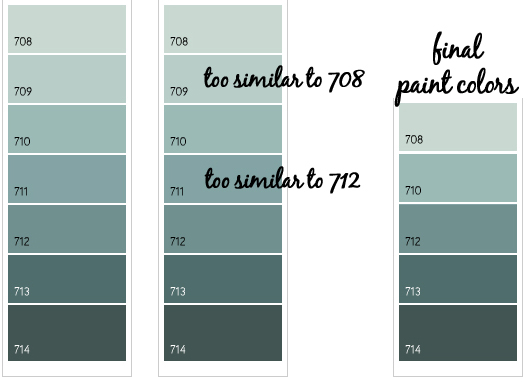
Finally, I found a Benjamin Moore paint strip with promise. It had seven colors (more stripes than I wanted to paint), but by simply choosing to eliminate two of them that felt too similar, I was left with five colors that I loved. I folded the paint strip to hide the two unwanted colors and was able to instantly visualize the gradation of the five remaining colors. I had a winner!
For those who love details, the final paint colors are Benjamin Moore’s White Rain (708), Kensington Green (710), Fort Pierce Green (712), Polished Slate (713), and Hidden Falls (714).
Even before the room colors were established, I had already been searching for and collecting some of the accessories for the nursery based on the concept of a simplistic animal theme. I found some fantastic all white animals for the shelves and a great grey and white zebra rug. To further tie in the white animal silhoutte concept, I had something special in mind for my mom to custom make for the room – but you’ll have to wait for the room reveal to see that.
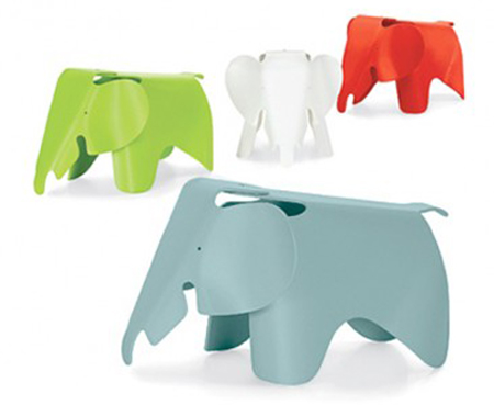
I also had my eye on an Eames Elephant for the nursery. This was going to be my splurge for the room! I seriously considered the white elephant to keep with the white animal theme, but ultimately decided the red elephant would be more of a feature in the space. I love that the Eames Elephant can serve as an artistic and sculptural element in the room – but is also made from a durable plastic and is just the right size for my little one to sit on and climb.
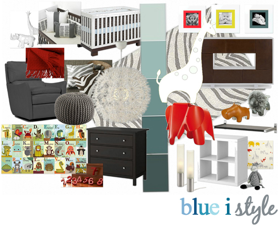
With so many ideas, I decided to finally try out OlioBoard (a website I had been hearing good things about) to create a moodboard to help me visualize how all of my ideas would come together. Here’s what I came up with…
[Sources: White Animal Sculptures (Z Gallerie, discontinued); Crib Bedding (Olio Sticks); Giraffe Wall Decal (Pottery Barn, disontinued); Zebra Rug (West Elm); Ottoman (CB2, similar ottoman also now available at Target); Light Fixture (Ikea); Eames Elephant (Amazon); Alphabet Zoo framed poster (Z Gallerie); Zuny Hippo (Amazon); Zuny Lion (Amazon); Number Drawer Pulls (PB Kids, discontinued); Stuffed Zebra (Pier 1 Imports); Check back for my next nursery post for the furniture details and sources]
In my next nursery blog post, I’ll discuss how we went about planning the layout for the long narrow room and selecting the furniture. As you’ll see later when I reveal the finished room – most of the items pictured in the mood board did find their way into the nursery. But a few things didn’t make the cut… as much as I wanted the large pendant light from Ikea, we ended up opting to install a ceiling fan in the room (the air movement created by a ceiling fan is said to help reduce the risk of SIDs). Also, that giraffe pictured near the center of the moodboard was straight out of the original Pottery Barn inspiration room.
While that PB collection had long since been discontinued, I found the 6 foot tall giraffe wall sticker on Ebay. I was SO excited… until he arrived and I learned he wasn’t really a wall sticker at all – he was more like wallpaper that had to be dipped in water to adhere to the wall. With the wall stripes that we painted, I feared the mess that might result when I tried to remove the giraffe someday. So, ironically, the one item that had served as my original inspiration for the nursery had to be nixed. Fortunately, however, I was able to find an equally adorable (and even taller) giraffe wall sticker on Etsy. But you’ll get to see him next week in the nursery reveal…in the mean time, check back soon for a post about the nursery space plan and a tutorial on how we painted the ombre stripes.
Update: Check out these links for all of the posts about the nursery…

