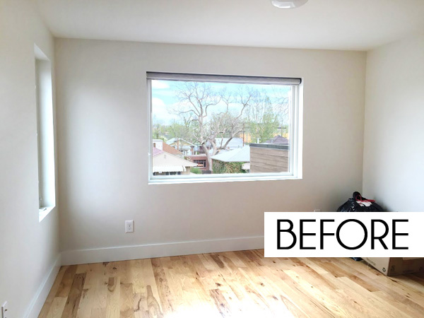
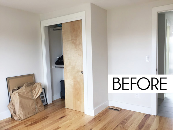
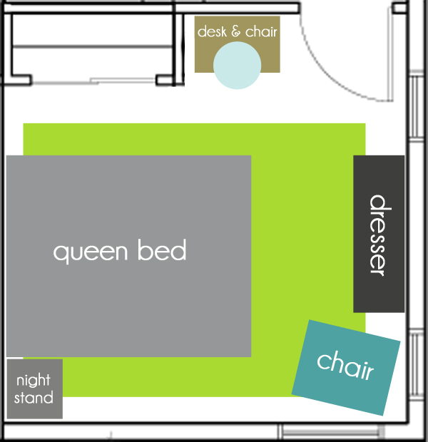
On the other side of the room, the closet juts out, creating a little nook next to the hallway door.
 |
| BED SOURCE LIST {affiliate links}: A | B | C | D | E |
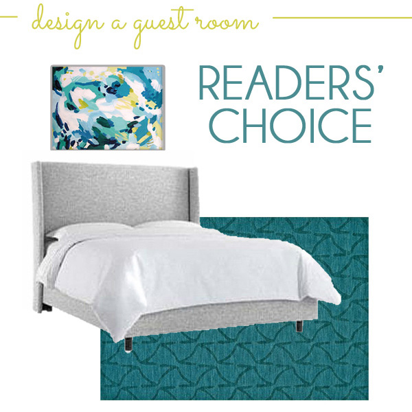
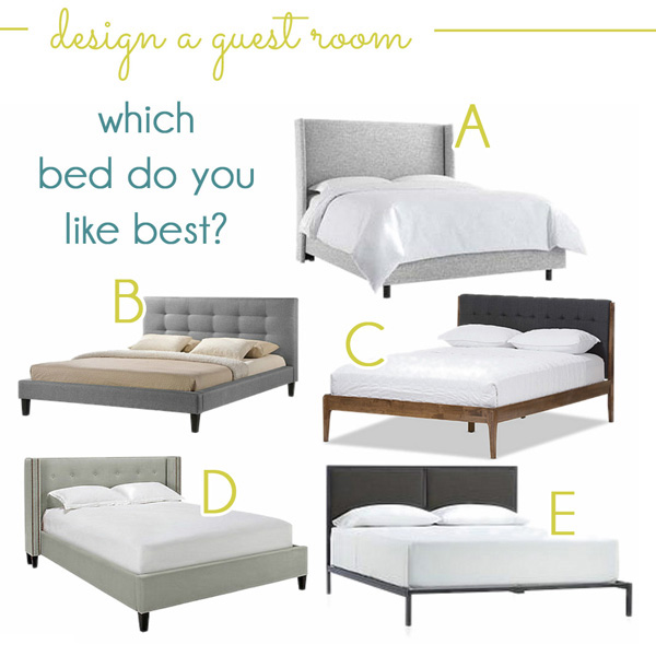
Bed option A – the Zuma Pumice Wingback Bed – won you all over in the voting, and I agree that it’s an excellent choice! I’m personally partial to the nailhead detail on option D and the wood trim on option C, but I’ll spill the beans and tell you that the client agreed with all of you in picking A!
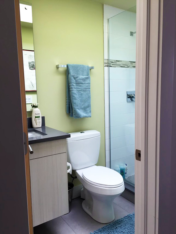
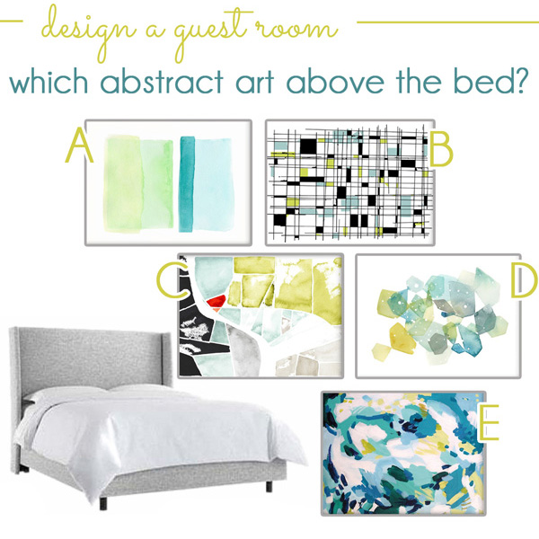
Next up, I showed you five different abstract art options… all of which pulled in those chartreuse green and aqua blue tones from the bathroom.
 |
| ART SOURCE LIST {affiliate links}: A | B | C | D | E |
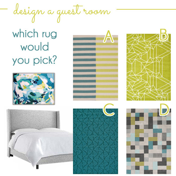 |
| ART SOURCE LIST {affiliate links}: A | B | C | D |
Before I show you the design plans I created, and the final plans for the room after the client’s input, let’s first talk about the layout of the space. I wanted this room to function as a home away from home for guests, with room for sleeping, relaxing, and even working, if necessary.
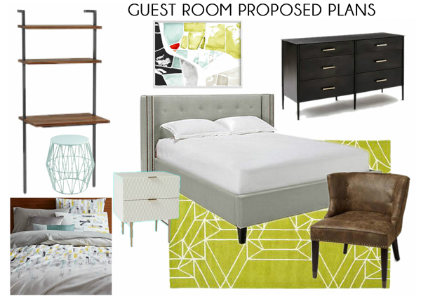 |
| SOURCE LIST {affiliate links}: Desk with Shelves | Surf Spray Stool | Seams Framed Art | Porter Bed | Lacquered Nighstand | Metal Works Dresser | Brushstrokes Bedding | Oragami Rug | Bennett Chair
I especially love that desk because it adds so much function while taking up very little visual space! It’s perfect for the proposed spot just inside the bedroom door, because it won’t make it feel crowed as you enter the room. And by using a stool rather than a chair, it can tuck all the way under the desk when it’s not in use.
The art I proposed reminds me of an aerial map – like the way you see the landscape from the window of an airplane. It has just the right shades or chartreuse and aqua to tie in with the bathroom, and I like that the one little touch of orangeish-red ties in with the bar and rooftop deck spaces. I recommended pairing the art with that bold greenish rug because I like the way the lines of the rug also have a map-like quality to compliment the art.
The dresser I recommended is actually made of hot-rolled steel. The sleek lines and industrial style fit the client’s modern style, while the textured drawer fronts on the white lacquer nightstand may have pushed him outside of his comfort-zone just a bit. I proposed the brown leather chair to tie in with the brown wood of the dresser {and because I’ve long been obsessed with this chair, and really want someone to give it a good home!}.
When I present design plans to a client, I always like to show them a few alternatives as well, just to help them visualize some other options. Then once I have their feedback, I can provide additional alternatives for any pieces that they just aren’t sure about. These are the initial alternatives that I presented to the client:
|
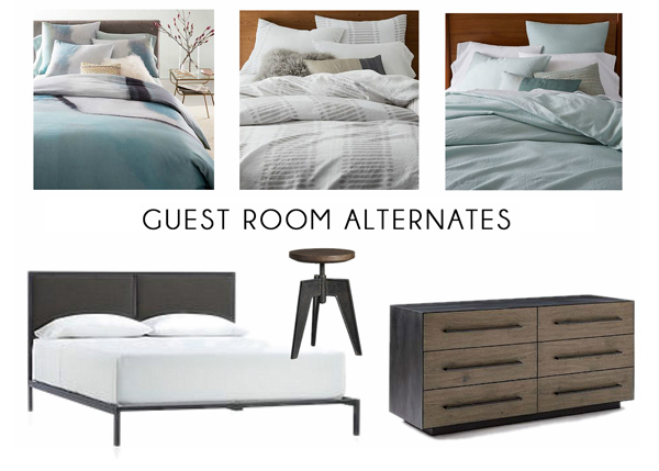 |
| SOURCE LIST {affiliate links}: Aqua & Gray Duvet | Gray & White Duvet | Pale Harbor Duvet | Oliver Bed | Contact Stool | Metal Wrapped Dresser |
The client was able to quickly tell me that he liked the brushstroke-style bedding from the original design board better than any of the alternatives I proposed, and he decided to stick with the original rolled metal dresser rather than the metal wrapped option with the wood drawer fronts. He did however, really prefer the industrial style stool, so we swapped that out in place of the aqua stool I had originally proposed.
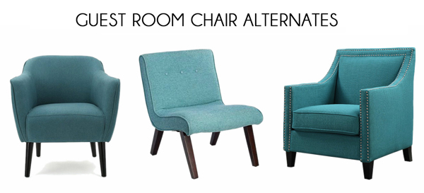
This brings us to the bed and chair. After looking at the proposed plans, the client told me that he really didn’t love nailheads and that he wasn’t a big fan of brown, so we went in search of a gray bed without nailheads {tufting and wing-back optional}, and we decided to swap out the brown chair for one in a blue tone instead.
These are all the beds we ended up considering for the space:
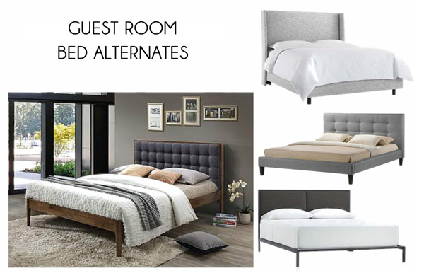 |
| BED SOURCE LIST {affiliate links}: Mid-Century Platform Bed | Zuma Pumice Wingback Bed | Baxton Studio Platform Bed | Oliver Bed |
 |
|
BED SOURCE LIST {affiliate links}: Aurianna Club Chair | Armless Tufted Chair | Curved Arms with Nailheads
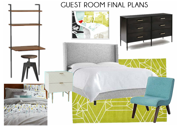
Ok, now that you’ve seen all the options and I’ve walked you through the whole process… here’s the finally design plan that we are executing for the client’s guest room! I really love the way it all came together! It’s modern but comfortable, and bold while still relaxing.
|
|
| SOURCE LIST {affiliate links}: Desk with Shelves | Contact Stool | Seams Framed Art | Zuma Pumice Wingback Bed | Lacquered Nighstand | Metal Works Dresser | Brushstrokes Bedding | Oragami Rug | Armless Tufted Chair |
