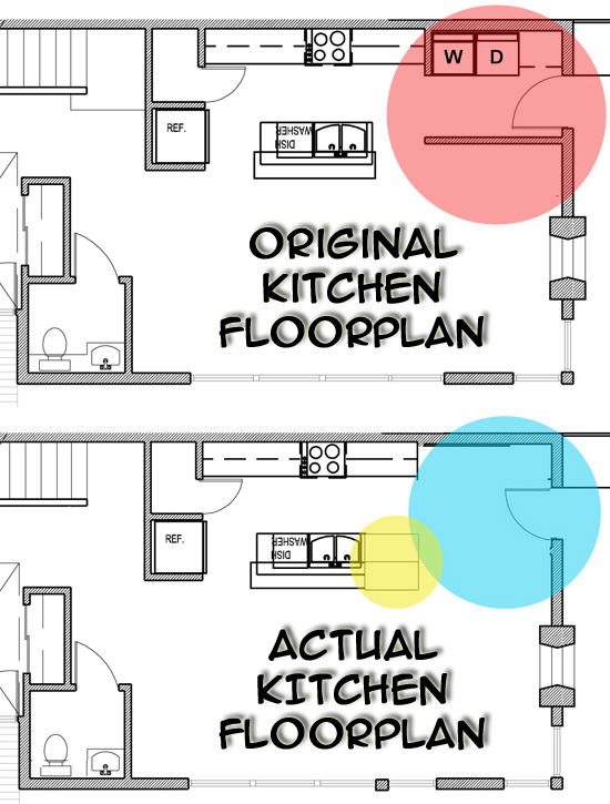
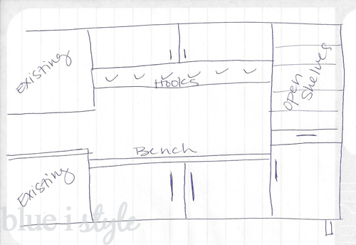
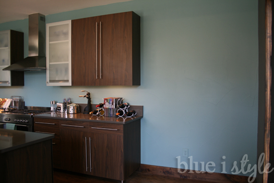
When we toured our house for the first time, before purchasing it, we couldn’t help but wonder why the kitchen cabinets came to an abrupt end, leaving five and a half feet of unused space. On move-in day, we found the original floor plans and blueprints for the house rolled up in the corner of a closet, and our question was answered. It turns out that the builder had originally planned for this space to be the “laundry room.” Thank goodness they thought better of that, and moved the laundry to the second floor. Here’s a quick reminder of what the original floor plan looked like, as compared to the actual layout of our kitchen.
We originally saw this unutilized space as a negative. Why didn’t the builder add more cabinets? I could really use some more cabinets! But then I realized that what we had was actually an opportunity to plan a use for the space that would perfectly suit our family’s needs. The easiest solution would have been to simply add more upper and lower cabinets, and to extend the counter top all the way across, which would have absolutely maximized our storage space. But the more I thought about it, the more I became excited about the idea of finding a more creative use for the space.
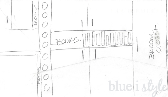
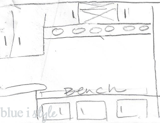
I started brainstorming all sorts of different ideas. I would draw my concepts on napkins and envelopes, or sketch them in the back of my notebook while waiting for a meeting to start. This is one of the first plans I came up with.
In this plan, we would have added floor to ceiling wine bottle storage to divide the existing cabinets from the new cabinets. To absolutely maximize storage space, I wanted to add upper and lower cabinets, with just a narrow opening between that would have been tall enough for one row of cookbooks, and a full height broom closet on the far right.
I think it’s always a good idea to live in a space for a little while before deciding to make any major changes because this allows you to really identify your needs and determine the changes that will have the most beneficial impacts. In our case, we didn’t have the budget to tackle any additions to the kitchen right away, which left me plenty of time to continue drawing up plans and thinking about other ways to the use the extra space. This time was a blessing because along the way we re-thought how make the most efficient use of the space.
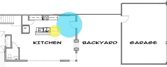
When we first moved into our home, it was just Scott and I, but we knew that we wanted to have kids, so I started to envision how we would use the kitchen as our family grew. Our house has a detached garage, and we cross through the backyard to enter the house through the back door. I found myself wishing that we had a mudroom so that our kids would have a place to sit down to take off their shoes and hang up their jackets and backpacks as soon as they entered the house. And then it occurred to me that while we would never have a separate, dedicated mudroom, we could create a mudroom-like space in the kitchen!
Initially, I was excited about the prospect of being able to create a mudroom on a dime by simply purchasing a long bench with some storage cubbies below, or possibly even DIY’ing a bench of some sort. And while this would have been a very cost effective option, it wouldn’t allow us address all of our needs. Additionally, I was really attached to the idea of a built-in addition that looked like it had always been there. So it was back to saving our pennies and continuing to dream up plans.
The longer we lived in our kitchen, the more our needs became clear. I made a list of what we really hoped to accomplish:
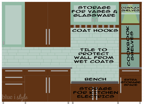
1. Bench for sitting down to remove wet shoes
2. Hooks for hanging jackets, purses and backpacks
3. Storage for kitchen electrics that were too tall for the shelves in our current cabinets
4. Storage for vases and other extra glassware
5. Wine rack
6. Shelves for cookbooks
7. Shelves to display antique glass items from our grandparents
8. Tile behind the bench to prevent wet coats from damaging the wall
This seemed like a tall order for a five and a half food wide space, but I enjoyed the challenge of coming up with designs that might fit the bill, again sketching them on random scraps of paper and stashing them all away in a folder for another day.
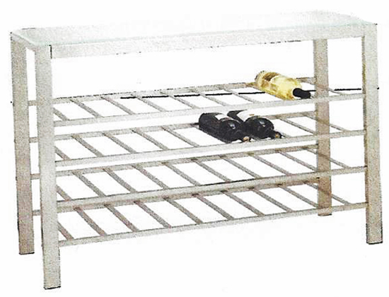
Along the way, we continued to decorate the rest of our kitchen and we fell in love with a console table wine rack that we purchased for another wall in the kitchen. {Sorry for the grainy photo – it’s from the catalog.}
Buying this wine rack allowed us to cross one thing off the mudroom wish list.
More brainstorming… More sketching… More saving our pennies… And finally a mudroom plan took shape that we fell in love with.
Our existing kitchen cabinets were custom-made, but the original cabinet maker was no longer in business, so we knew that we were going to have to work with an experienced contractor that could construct matching cabinets. We decided we would also have the contractor install tile above the bench, as well as spanning the entire length of the kitchen, providing the beautifully finished backsplash we had always wanted!
It’s always been pretty easy for me to look at a blank slate and envision what it will look like when complete, but my husband has a harder time “seeing” things.
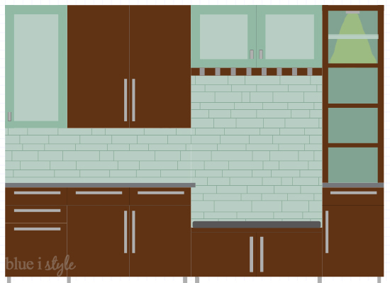
Scott asked me if I could do a mock-up of sorts to help him get a better idea of what the kitchen mudroom would look like before we hired a contractor and committed to a plan. And that’s exactly what I did. I used Photoshop to create a rendering of my vision for the kitchen addition.
The left half of this rendering represents existing cabinets, while the right half represents the mudroom plan. In addition to looking pretty, this illustration allowed us to really see how this plan would satisfy our long wish list. In the bank of shelves, we planned to use the lower shelves for my cookbook collection, and the upper two shelves for display items. I wanted the uppermost shelf to be glass to allow light to shine through making the items on these shelves more of a feature.
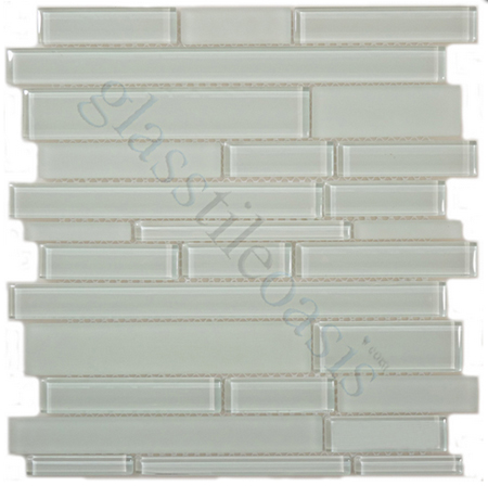
As our plans continued to come together, we picked out our backsplash tile. Because there are no windows adjacent to our kitchen prep area, we knew we wanted to use glass tile to help reflect the natural light in the kitchen, as well as maximize the impact of our under cabinet lighting. After looking at a lot of options, we ended up selecting this Davinci tile in a random, long and thin brick pattern, with a combination of glossy and frosted tiles. We chose this tile, in part, to tie in with the frosted doors on our glass front cabinets.
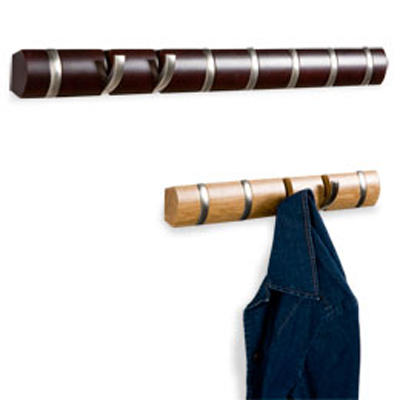
I also did a lot of looking for the perfect coat hooks. When I came across the Umbra Flip Racks at the Container Store, I was hooked {haha}! The color of the dark wood rack was almost an identical match to our kitchen cabinets, which would allow us to achieve a truly built-in, custom look, and I was a huge fan of the way the that hooks flip out to hold jackets and bags, but fold flat when not in use.
