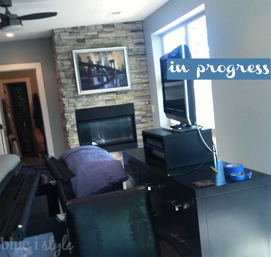
Finally! Finally a week where I feel like I can see real progress and I’m excited to write my One Room Challenge update! Nonetheless, the chaos in our master bedroom {which I referred to last week as the “Storm Before the Calm”} remains. In fact, the chaos increased when we had to move all of the furniture to the center of the room in order to paint, but hubby and I have temporarily relocated to the guest room and having a restful place to sleep has improved my perspective.
This week, my efforts have been all about DIY art projects, but before I get to that, let me share a few other updates.
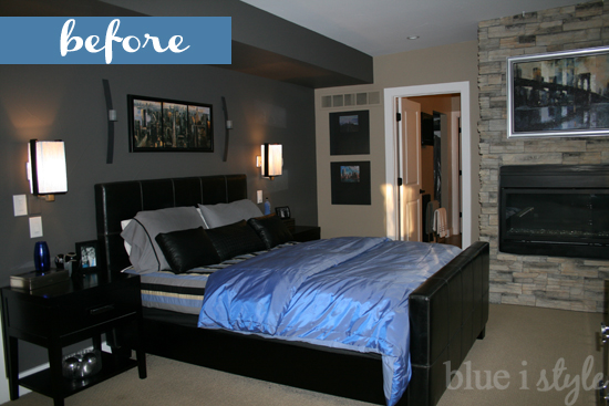
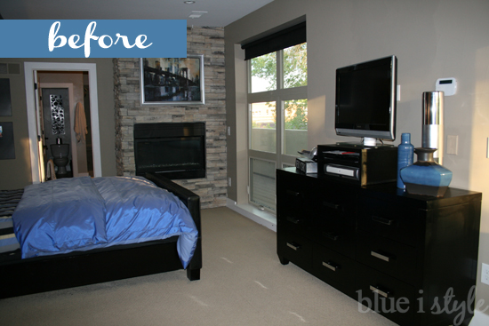
We banished the beige! The builder of our house painted one charcoal colored accent wall in our master bedroom, which we love, but the remainder of the room was a dark tan. The color itself worked fine with our decor, but I felt like it blended in too much with our stacked stone fireplace, and the color was a real light sucker! Despite being south facing and having a very large window, as well as two sliders, the room always felt dark and a bit bleak.
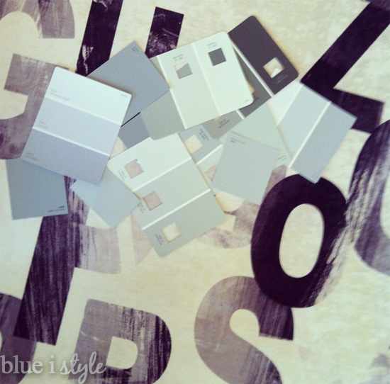
If you follow me on Instagram, then you know that we were surrounded by grey paint samples this week. Picking the right paint color is always a challenge, but greys might be the most difficult. As one commenter so perfectly put it – grey is a color chameleon! If you aren’t careful, you can end up with a grey paint that reads baby blue, khaki green, or even purple once it’s on the walls.
After a lot of consideration and comparisons, we finally picked Benjamin Moore’s Metropolitan. Don’t you just love when even the color name seems perfect for the space? When I shared my design plans for the master bedroom in week 1, I titled the plan “Modern Metro Master” – and now the room really is metropolitan right down to the paint on the walls. {This happened in Beckett’s room during the Spring One Room Challenge as well. Two of the paint colors in my son’s “Little Gentleman’s Lounge” were called Soft Jazz and Symphony Blue}.
Because of the challenge of painting around the stacked stone in the room, and because of the time constraints, we decided to pay someone to paint the room. I generally do my own painting, so I am surrounded by the color as it goes up on the walls. But this time it was fun to walk in and see the impact of the new color once it was completely painted. The light grey really brightens up the space, and the fireplace now feels like even more of a feature.
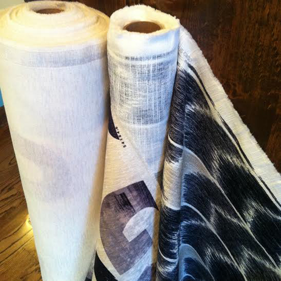
My mom is helping me to make the flat panel drapes for the bedroom, as well as a new blanket for our bed, so she stopped by this week to pick up the fabric. After living with only solar shades, but no drapes, for the past 6 years, I really can’t wait to see the drastic difference the drapery panels will make!
Ok, now one to what I’m really excited about!! I mentioned in week 1 that I wanted to find a way to make the television on our dresser less of a focal point – especially since it is the first thing you see when walking through the bedroom door .
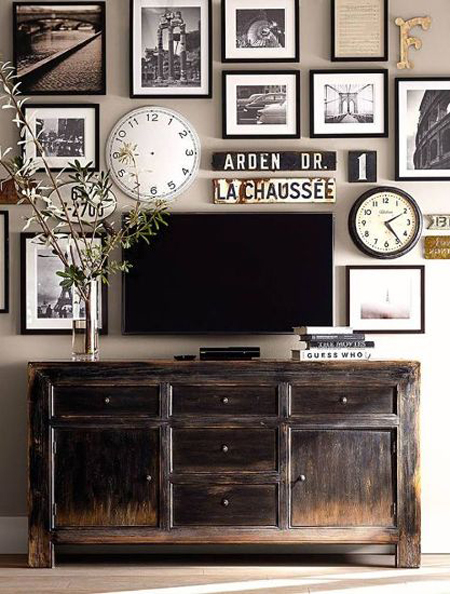
Long ago I pinned this inspiration photo from Pottery Barn, and I’ve known since then that I wanted to create a gallery wall around our tv.
 |
| via Pottery Barn |
With this photo as my television gallery wall inspiration, I began creating a list of photos and other items to fill the space around our tv. Since it’s in our master bedroom, I want the photos to be all about the two of us – but I don’t want an entire wall of photos of us. To give the gallery a high-end and collected feel, I knew I wanted to mix in some works of art.
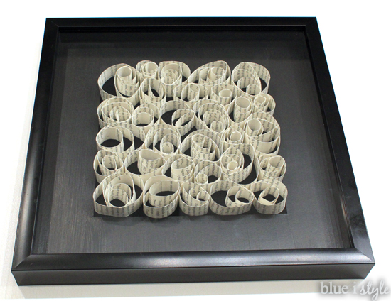
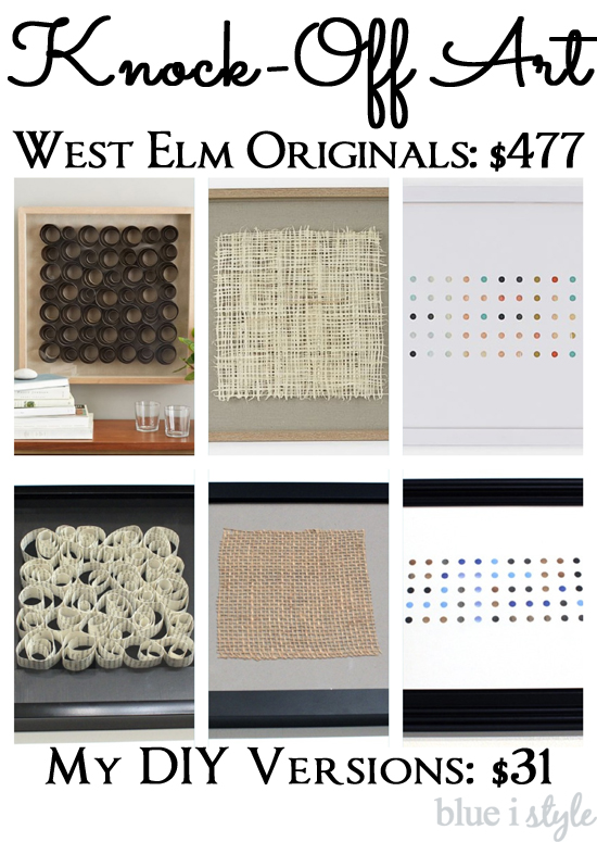
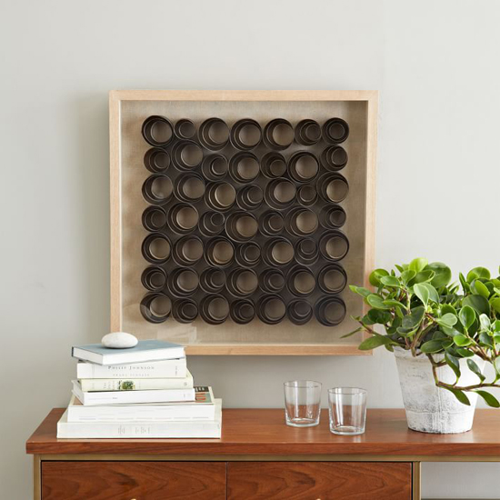
A few weeks ago I was walking through my local West Elm when I this awesome framed art caught my eye. I love the spirals that appear to be floating inside the frame, but I didn’t love the $199 price tag!
 |
| via West Elm |
The original was created from thinly shaved pieces of stained ash wood arranged on a linen backdrop – but I knew I could create a similar look in a shadow box using spirals of paper. I love the consistent look of the black frames in the gallery wall inspiration photo, so I purchased a 12×12 black shadow box frame. Rather than creating my spirals from a solid color of paper {which would have looked even more like the original}, I instead went for a modern, graphic look by creating my spirals from book pages. I’ll share my full tutorial on this project soon, but here’s a quick look at my finished work of DIY art. Best of all, it only cost me the price of the shadow box and a mat…$14!
I was also inspired by two other works of art from the current West Elm art collection, and I managed to knock both of them off for even smaller price tags!
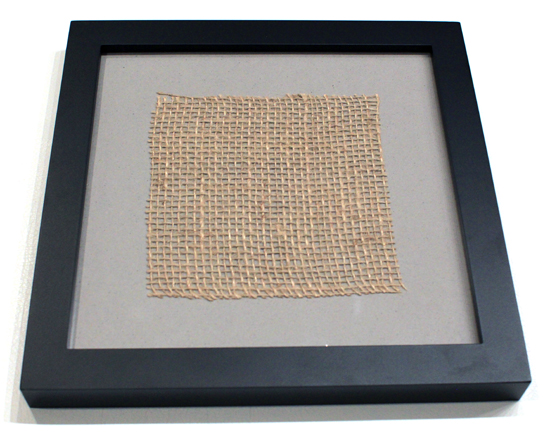
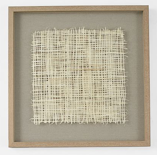
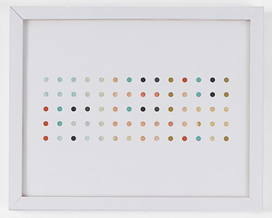
This framed piece of handmade paper from West Elm appealed to me because it would bring a nice natural color and texture to help balance the modern finishes in our bedroom – but once again, the $189 price tag just wasn’t in the budget.
 |
| via West Elm |
 |
| via West Elm |
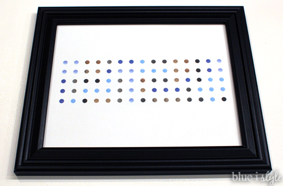
But I put my Photoshop skills to work and created a knock-off version in my color scheme for nothing more than the cost of the $7 picture frame.
I’ll share my process for creating this art, and the secret behind my version that makes it extra meaningful, in a future post!
So now you see why I’m so excited! For a mere $31 and a small investment of time, I was able to create three pieces of West Elm inspired art work that are customized to perfectly fit into my planned television gallery wall!
In other news, the chair for my reading nook {the Meloni} that I selected through my partnership with Home Decorators Collection, has shipped and is scheduled to arrive mid-next week. I am counting the days! I also finally found an ottoman that I think will work well in the space {with a few minor modifications that I have in mind}.
The One Room Challenge is hosted by the fab Linda of Calling it Home, and there are 20 amazing designers headlining the event, and more than 80 other linking participants {like myself}. Each week they are sharing their updates as well, so be sure to check out the progress everyone else has made in Week 4. There are some amazing spaces starting to take shape!
You can find all of my past One Room Challenge posts here:
FALL 2014 ONE ROOM CHALLENGE: Modern Metro Master Bedroom
SPRING 2014 ONE ROOM CHALLENGE: Vintage Preppy Little Man’s Lounge
