A couple of weeks ago I dubbed the status of my progress on the One Room Challenge “the storm before the calm”- and now that Week 5 has come and gone, I am finally starting to see some of the calm. In all of my design projects, it always gets worse before it gets better, and I am happy to report that I can now see a glimmer of the calm as the completed space starts to really take shape.
To quickly catch you up, I am participating in the One Room Challenge for which I am redesigning our master bedroom in a short six weeks. Today marks the end of week 5, and at this time next week I’ll be sharing lots of photos of the final room! Here’s what the plan looks like, which I fondly refer to as the Modern Metro Master Plan…
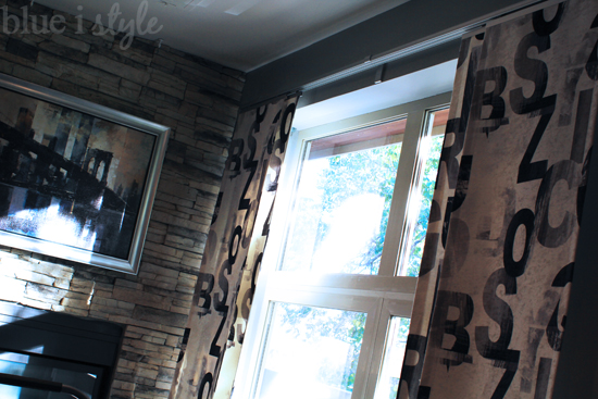
This week’s major accomplishment – our modern, flat panel curtains! I’ll share a lot more details about these curtains at a later time, but let’s just say that in standard Ikea form, the hardware was a bit complicated to assemble and install. But now that the custom fabric panels are hung, there is no doubt in my mind they were worth all the effort! I think you’ll agree next week that the curtains are the true star of the room.
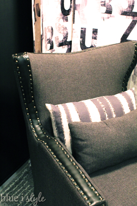
In other exciting news, the Meloni chair for my reading nook {which I selected through my partnership with Home Decorators Collection} arrived yesterday! I’ve ordered a lot of furniture online, but I still always get a bit nervous about whether it will look as good in person as it does online – and especially with an item like an arm chair, I always worry about whether it will really be comfortable. Yes, and yes! I had a pretty long list of requirements when shopping for a chair for our bedroom {it needed to have a high enough back to rest my head; a wide enough seat to sit cross-legged; padded but not rolled arms; and style for days}, and I can now confirm that the Meloni ticks all of those boxes!
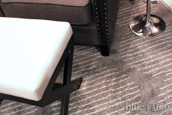
To make for even more cozy reading nook, I also purchased an inexpensive ottoman. I have a plan to add a little something extra to make this ottoman better fit with the chair and side table. You’ll have to wait until next week for that – but I think you’ll agree that it’s $12 well spent!
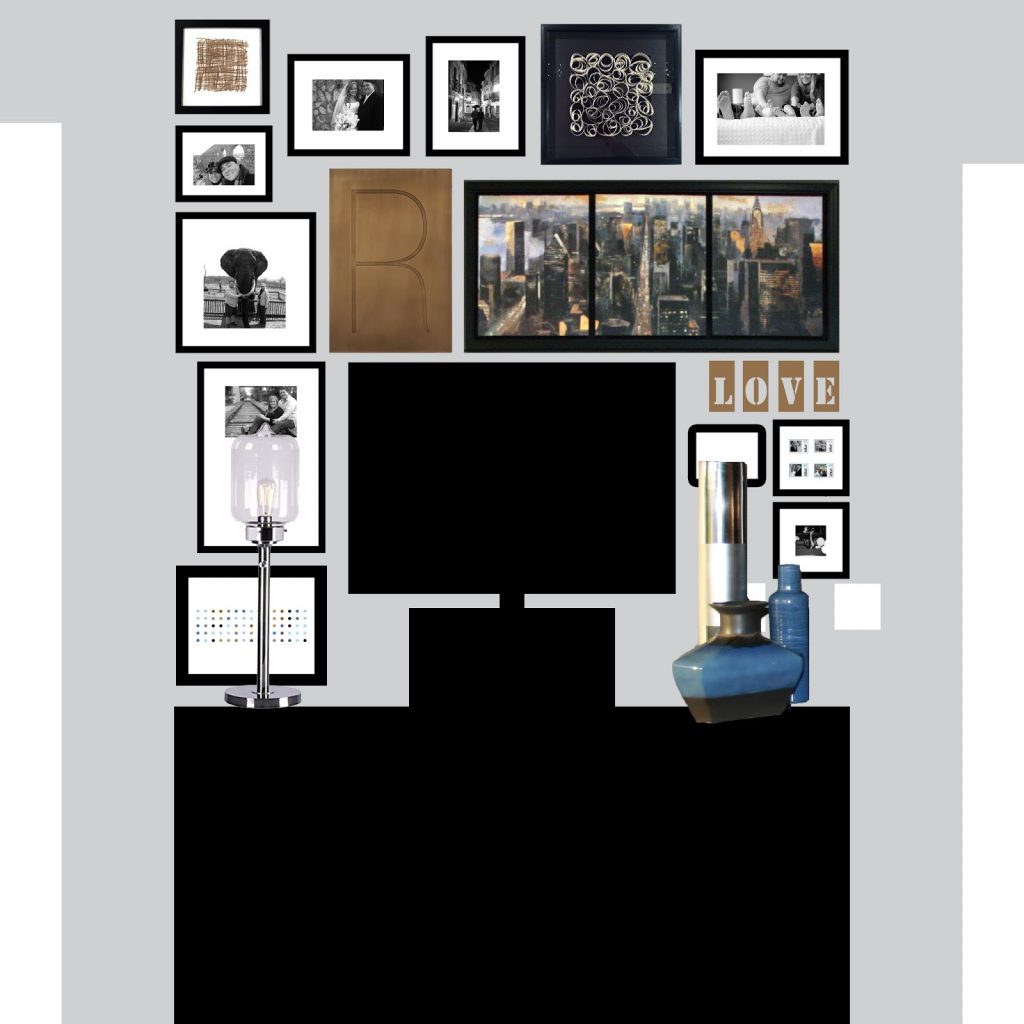
What remains to be done is mostly about the art and photos. Last week I shared an inspiration photo for a gallery wall to make the television on our dresser less of a focal point, and now the gallery wall is ready to be hung. I am nothing if not a planner, and I am often known to create computer renderings to aid in my husband into visualizing my crazy ideas. Here’s my computer rendering of what the gallery wall is going to look like {if all goes according to plan}…
I am also making a few updates to the DIY metallic photos that have hung in our room for years. I still love the way these framed photos of New York City appear to glow, but I am swapping out a few of the photos for ones we took on our most recent trip to NYC.
So here’s where I’m at on my master list:
The One Room Challenge is hosted by the wonderful Linda of Calling it Home, and there are 20 amazing designers headlining the event, and more than 80 other linking participants {like myself}. Each week they are sharing their updates as well, so be sure to check out everyone’s progress as we enter the home stretch!
You can find all of my past One Room Challenge posts here {click on the photos to be redirected}:
FALL 2014 ONE ROOM CHALLENGE: Modern Metro Master Bedroom
SPRING 2014 ONE ROOM CHALLENGE: Vintage Preppy Little Man’s Lounge
