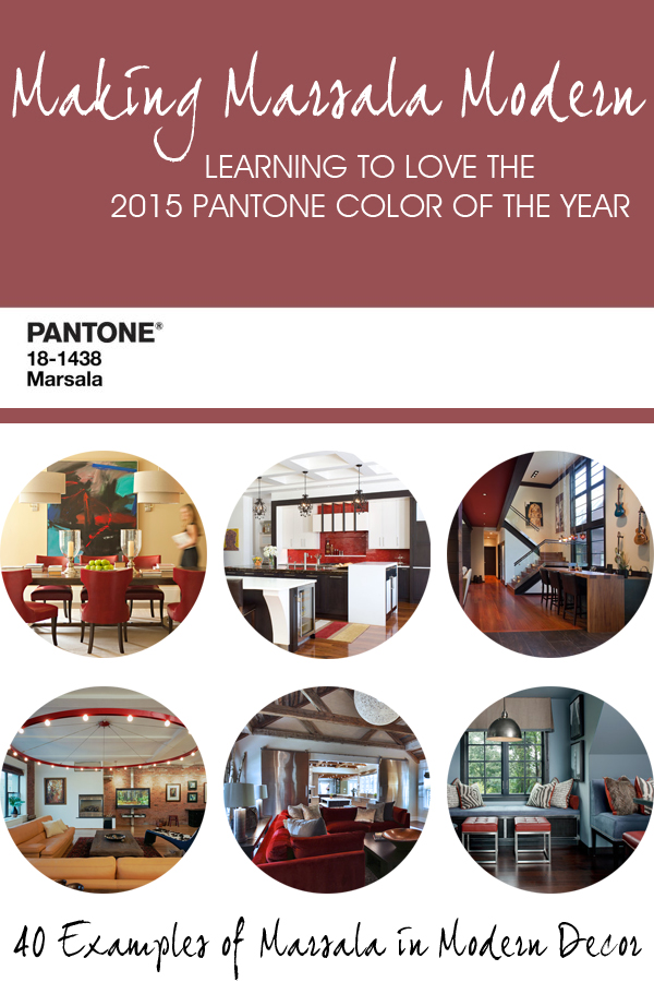
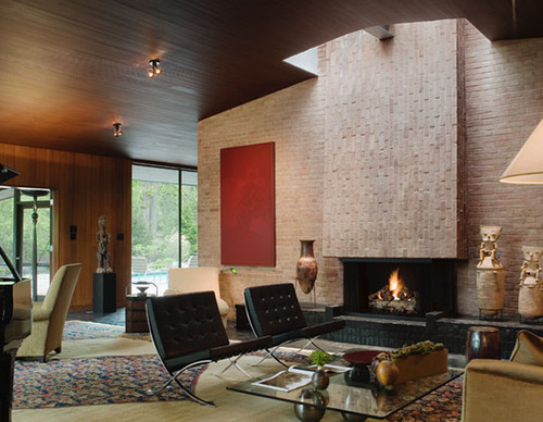
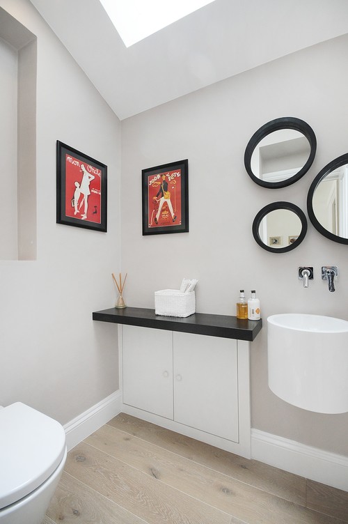
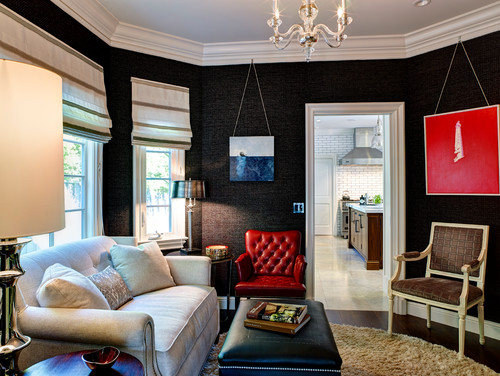
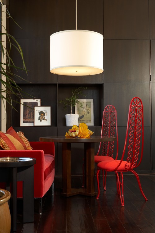
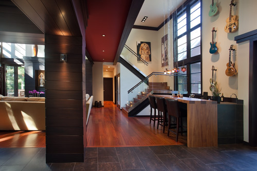
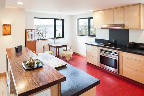
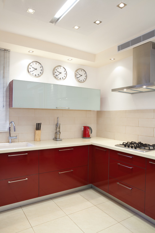
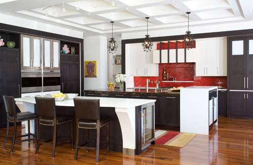
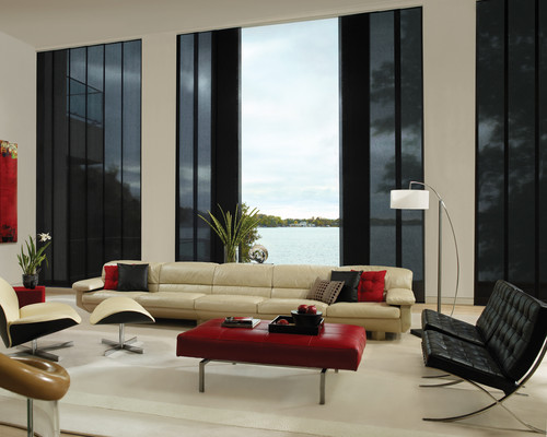
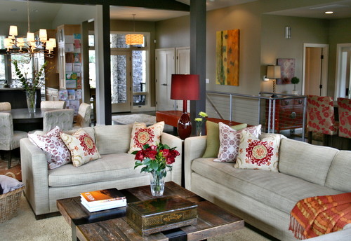
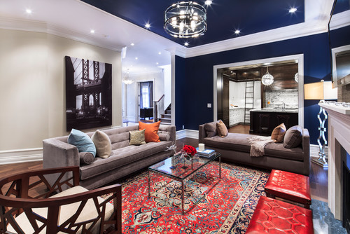
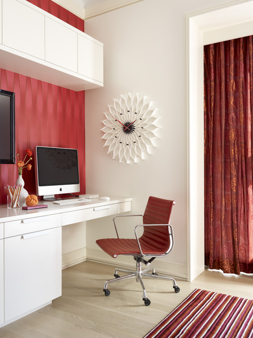
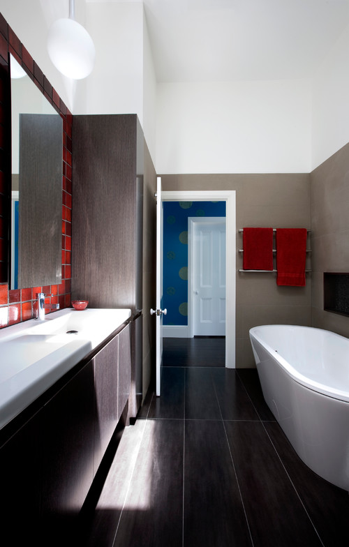
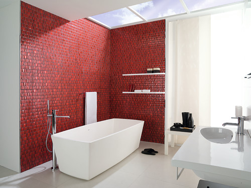
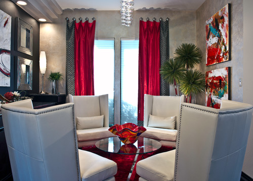
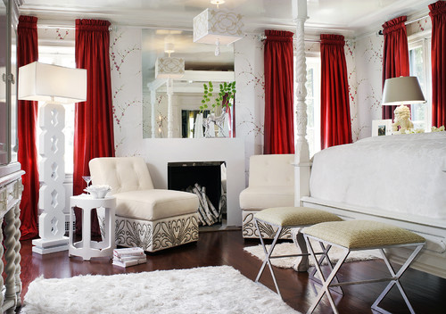
I know I was not alone in thinking that modern and Marsala don’t go together, so I decided to share some of my favorite photos from Houzz to prove that the Pantone Color of the Year can actually be a great addition to modern decor!
Some of these rooms are extremely modern, while others are a bit more transitional style, but everyone of them appeals to my design eye. I found the color being used in lots of different ways – from subtle accents to bold statements, and while I can’t imagine I’ll be painting a wall or tiling my bathroom in this color any time soon, the photos I’ve selected do inspire me to give Marsala a second chance in my home office.
One final note before I show you the pretty pictures: not every one of these photos is an exact match for Marsala – some are a bit more redish and some are a tad more purplish, but all are in a similar color family.
Without further ado, I present MAKING MARSALA MODERN…
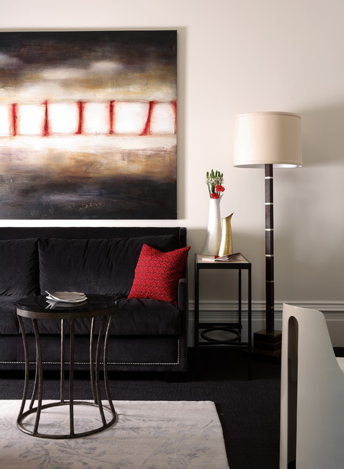
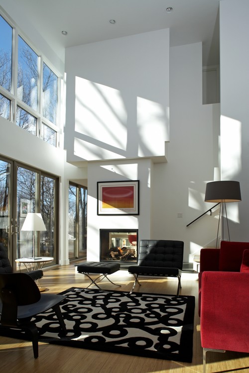
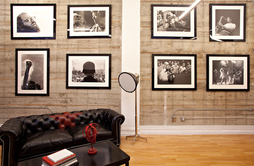
…PAIRED WITH BLACK & WHITE
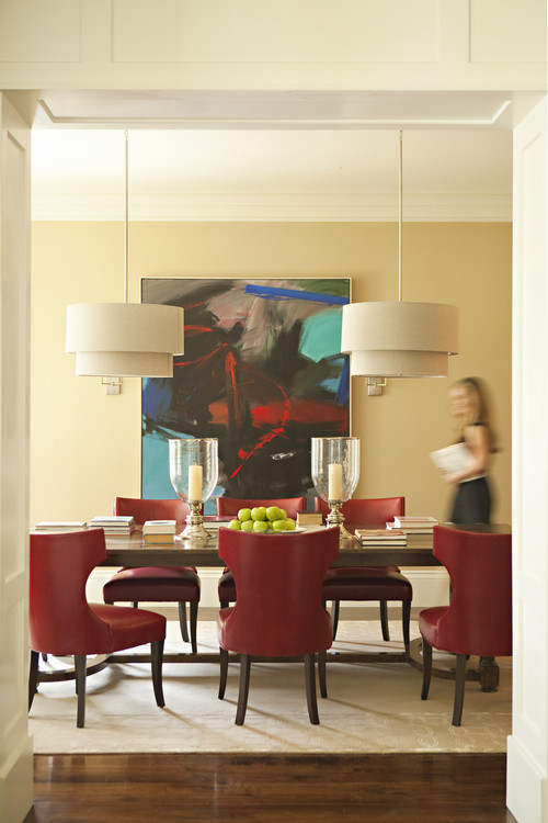
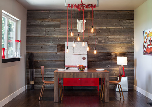
…IN THE DINING ROOM
…IN SMALL ACCESSORIES
…AS LARGE ARTWORK
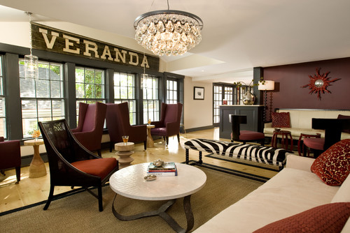
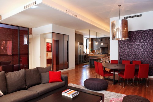
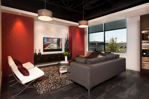
…WITH DARK WALLS
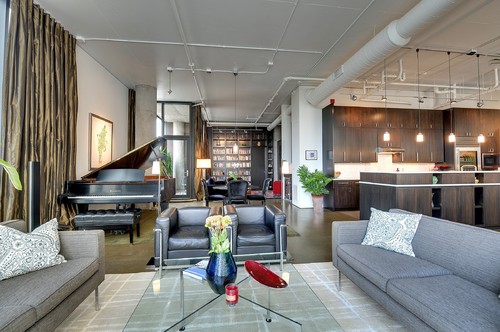
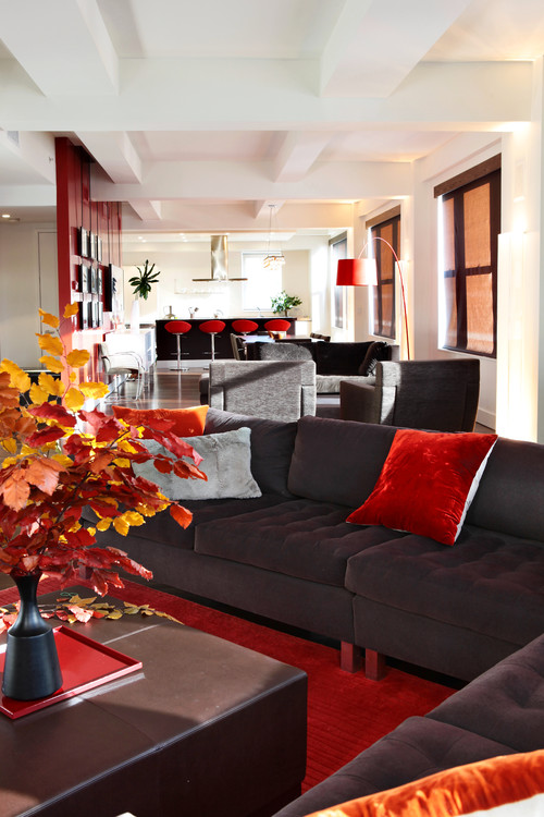
…IN A LOUNGE
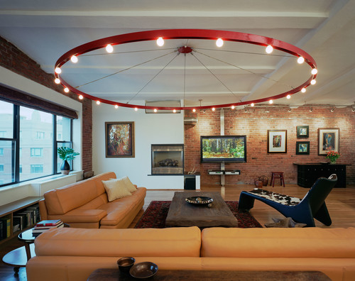
…ON THE CEILING
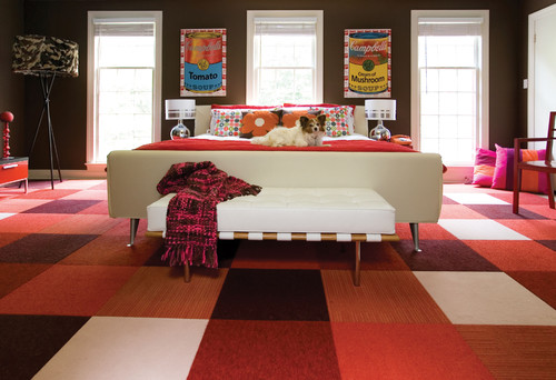
…ON THE FLOOR
…ON KITCHEN CABINETS
…ON A BACKSPLASH
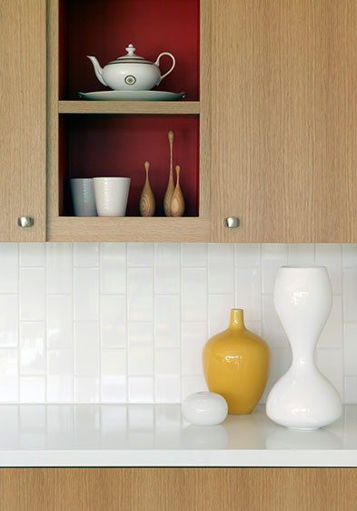
…INSIDE CABINETS OR BOOKCASES
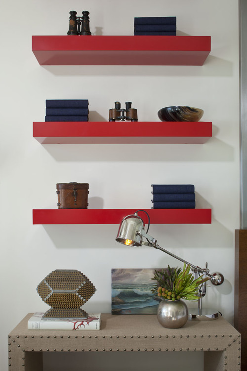
…ON SHELVES
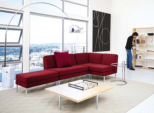
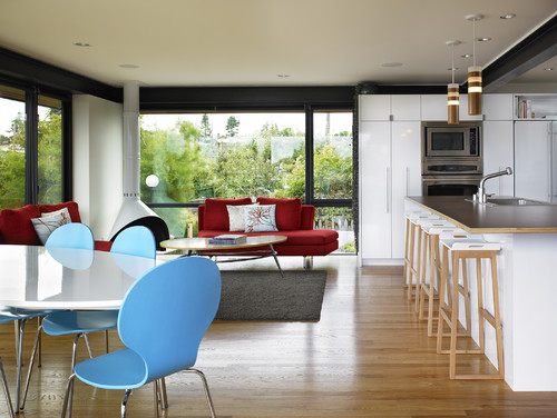
…ON THE COUCH
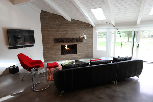
…ON A CHAIR
…ON THE OTTOMAN
…ON A LAMP & PILLOWS
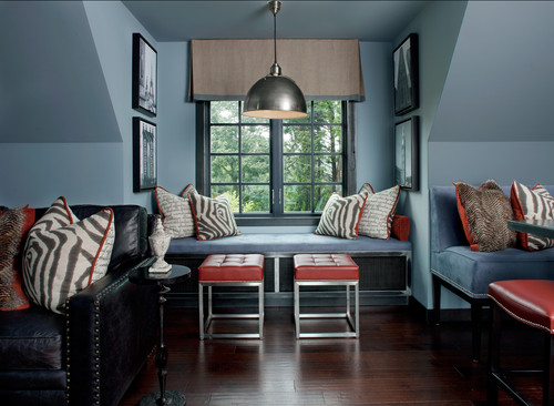
…PAIRED WITH NAVY BLUE
…IN A BRIGHT HOME OFFICE
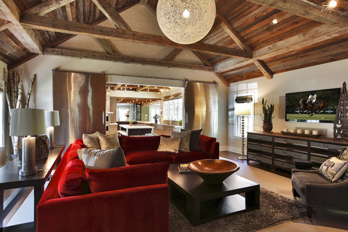
…THROUGHOUT A GREAT ROOM
…IN A RUSTIC MODERN SPACE
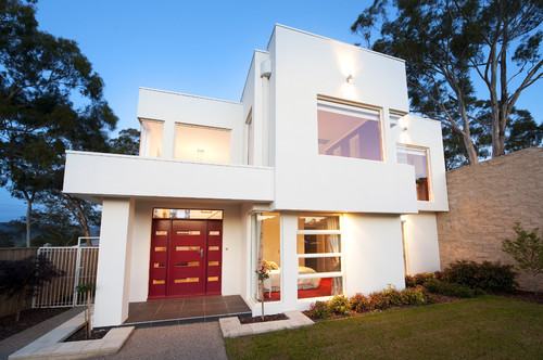
…ON THE FRONT DOOR
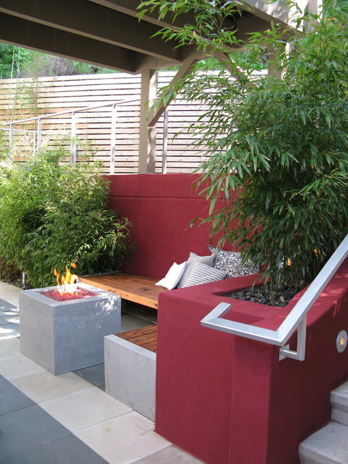
…ON THE PATIO
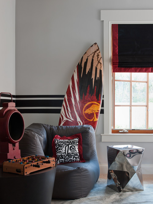
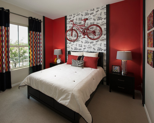
…IN A TEEN BOY’S ROOM
…IN A TEEN GIRLS ROOM
…IN THE BATHROOM
…ON THE WINDOWS
…AS AN ACCENT TO GRAY
…AS AN ACCENT TO BLUE GRAY
….AS A COMPLIMENT TO TURQUOISE
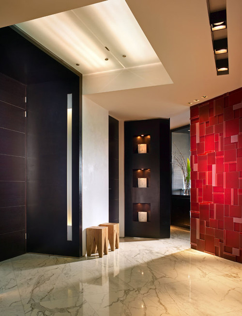
…ON A FEATURE WALL
Now I want to hear what you think! Do you love Marsala, or love to hate it? Can you picture it in your home? Do any of these photos inspire you to see the color differently?
