I love helping friends and clients give their spaces a fresh, new look without breaking the bank! One of the most common request I get is to redesign a room to give it an updated look without the expense of replacing the furniture.
Especially when it comes to decorating a bedroom, this is totally doable, and I’m sharing my 10 best tips! Even though I’m sharing 10 tips in this post, I want to stress that you don’t need to make all 10 of these updates to get the new look you are after! With even just a few of these changes, you can totally refresh you space and create a room that you absolutely love on a very tight budget!

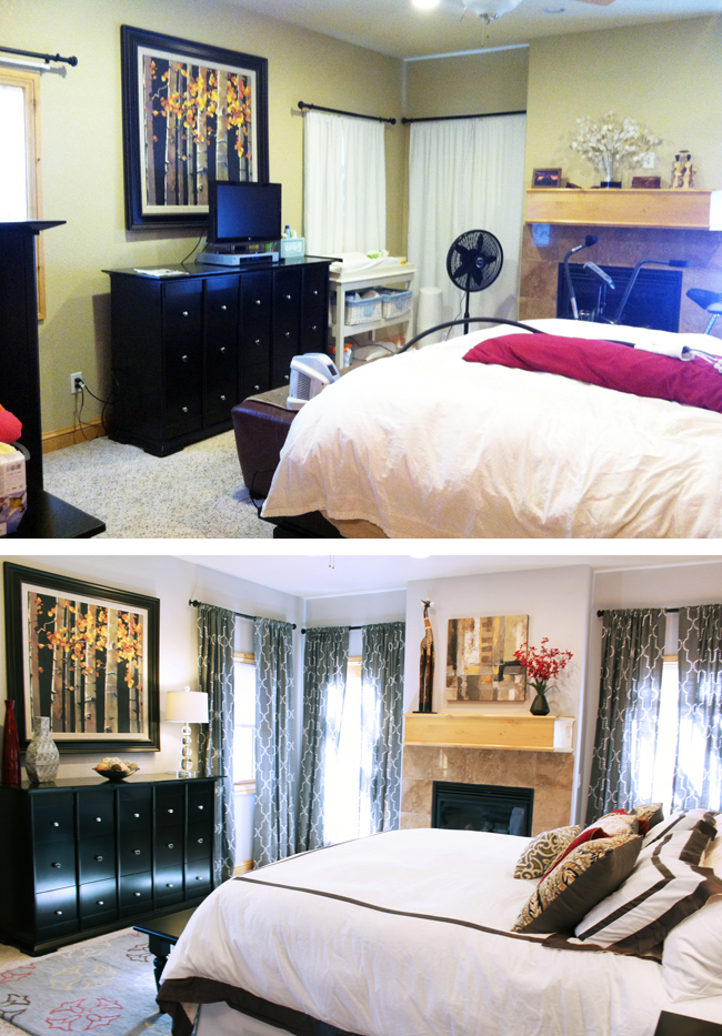
Before we dive in the tips, let me start by showing you a before and after of a master bedroom that I redecorated for a friend years ago. Not only did we not replace any of the furniture in this room {other than swapping the headboard with one from their guest room}, we didn’t even rearrange the layout of the furniture because the placement of the fireplace and windows clearly dictated where the king bed had to go.
Now that you see what is possible with just a few minor, inexpensive changes, I want to give you some concrete steps to follow to achieve the same kind of makeover in your own home! I use a master bedroom as an example in this post, but most of these tips apply to any other room, as well.
Rather than just giving your some generic advice about how to redecorate a bedroom when you don’t want to buy new furniture, I want to walk you though it step by step, using another recent client project as an example. So let’s start where every decor project begins… with the before photos.
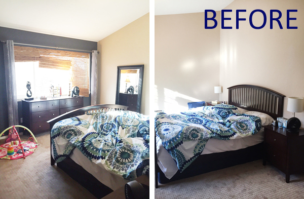
After redesigning the entire main floor for a super fun family {you can see their family room here}, they asked me to help with their master bedroom as well. Here’s how it looked:
CONSIDER THE SPACE PLAN
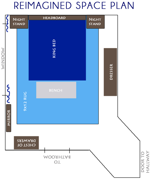
The homeowners wanted to keep their existing dresser, chest of drawers, night stands, and stand-up mirror, so before we even started talking design concepts, I first considered the space plan and whether the furniture could be rearranged to create a better flow in the room.
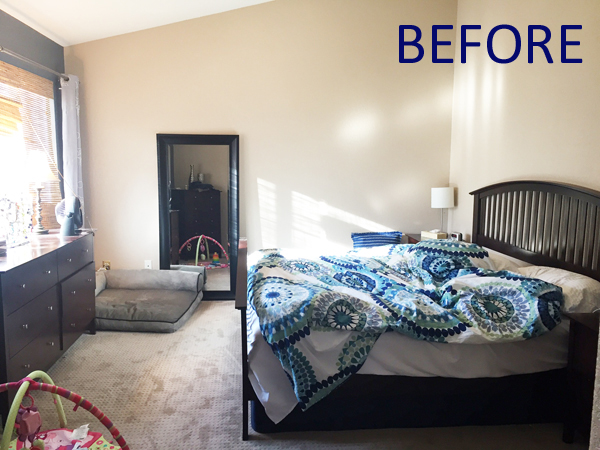
In its original configuration, there was one big, empty wall. I felt like the vaulted ceiling should be more of a feature, so I wanted to reposition the bed to that wall. I also wanted to give the homeowners a comfortable place to sit down, but in order to keep all the existing furniture, there wasn’t room for a chair. Instead, I decided to fit a bench at the end of the bed.
I’m really happy with the new layout for this room that makes the bed more of a focal point, and the wall above it, more of a focal point, but in many bedrooms, the furniture will only fit in one configuration. This was the case in my own master bedroom, as well this prior client master bedroom I redesigned, and in both rooms I was able to achieve a completely new look without buying new furniture or rearranging the layout.
THINK ABOUT THE STYLE YOU WANT
When you’re ready to give your bedroom a new look, find inspiration in your favorite magazines or catalogs, on Pinterest, or using the Houzz app. It helps to have an idea of the style you want to achieve before you start buying anything!
You may already have a color palette in mind at this stage, but if you don’t, that’s perfectly ok. It can develop as you work through the process.
These homeowners love the outdoors and lived in the mountains before moving to their current home, but they also love modern decor. I wanted to give them a modern and sophisticated, but cozy space that drew inspiration from nature.
If there’s an element in the room that you can’t change, like the color of the wood trim or floors, carpet, or wall color {if painting is not an option}, then it’s better to work with it than to fight against it. Read this post about a bedroom I redesigned for another client for a detailed explanation of how to approach this kind of challenge, and see how that final room turned out.
*This post contains affiliate links. If you purchase something I recommend, you’ll pay the same price, but I may receive a small commission.
START WITH A NEW RUG
Once you have a general sense of styles you like, start by shopping for a rug for the bedroom. Choosing a rug first can help set the color palette and better define the design direction.
If you already know what color palette you want, utilize the search filters that most online sites offer to narrow your search to those colors. If you’re unsure on colors, filter by style instead, and see what rugs catch you eye. You can then develop the color scheme for the room around the rug you fall in love with.
For this bedroom, I envisioned a color palette in shades of blue, so I wanted to find a rug that would provide some interest while staying largely monochromatic. This Oriental Navy Distressed Rug caught my eye because of the depth of the over-dyed colors, and because the more traditional style would provide a nice contrast to the other modern and nature-inspired elements wanted to layer in.

I found an incredible sale price on this rug in a 9×12 – large enough to place below the entire bed. If the rug you love is not available this large, or if the price is too high for the budget, consider instead placing a 5×8 rug one-third of the way under the foot of the bed, so that the remainder of the rug creates a nice focal point at the end of the bed {as I did in this room}.
PAINT THE WALLS
If you have the freedom to change the walls {if you’re not in a rental space}, then paint is one of the least expensive ways to give a space a whole new look. A fresh coat of a light, neutral color {learn how to pick the right one} can brighten up a room and give it a fresh start, a bold color choice can liven up a room and give it new life, or a dark, rich color can create a moody, cozy vibe.
In my client’s bedroom, I struck a balance between light and bright, and rich and moody. The homeowners wanted to move away from the beige tones in favor of a more modern neutral, so most of the walls in the room got a fresh coat of light gray paint. But I also wanted to turn the vaulted bed wall into a dramatic focal point, so I recommended a shade of rich navy blue for that wall. They ended up choosing Sherwin Williams Anchors Aweigh (SW 9179).
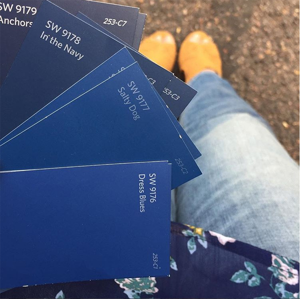
By selecting the rug first, we were able to compare the paint samples to the rug to choose a good compliment. This is much easier than choosing a paint color first and then trying to find a rug to match.
ADD OR UPDATE ART TO DEFINE THE STYLE
With the rug and paint colors selected, you’re ready to start choosing art and linens. These are the layers that will really determine the overall style of the room. I find it easiest to shop for one thing you love, and then build on it from there.
One of my favorite sources for affordable art is Minted. I love that you can easily browse their extensive collection by filtering for color or style, and that anything you find can be ordered in a huge variety of size and framing options. There’s nothing worse than finding a piece of art you love, but having it be the wrong size for your space. Minted eliminates that problem and gives you lots of design freedom.
For my clients bedroom, I found this photo called “Aspens at Altitude.” I wanted to use it above the bed to give the sense of laying in bed and looking up into a forest of trees. I knew the white image was also perfect for creating contrast against the dark navy wall.

Rather than recommending one large print of this photo above the bed, I instead wanted to hang 5 identical photos across the wall for the feeling of being surrounded by the trees. To help offset the cost of ordering five 18×24″ prints, we ordered them unframed, and then purchased nice white frames at Aaron Brothers during one of their semi-annual “buy a frame, get one for a penny” sales.
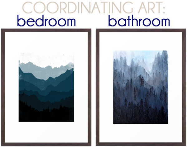
I also wanted to add some other art in the room that would bring in more shades of deep, rich blues. I was searching for a modern representation of nature to balance the photography, and found exactly what I wanted in these coordinating ombre art prints of mountains and trees. I recommended one for the bedroom, and one for the bathroom as a way of tying these two spaces together.
CHOOSE SIMPLE LINENS
When it comes to picking bedding, I advise choosing a simple duvet cover or bedspread. If you choose a pattern, keep in a minimal so that you’re less likely to tire of it quickly. You can always add more color or pattern with throw pillows that can be updated easily over time.
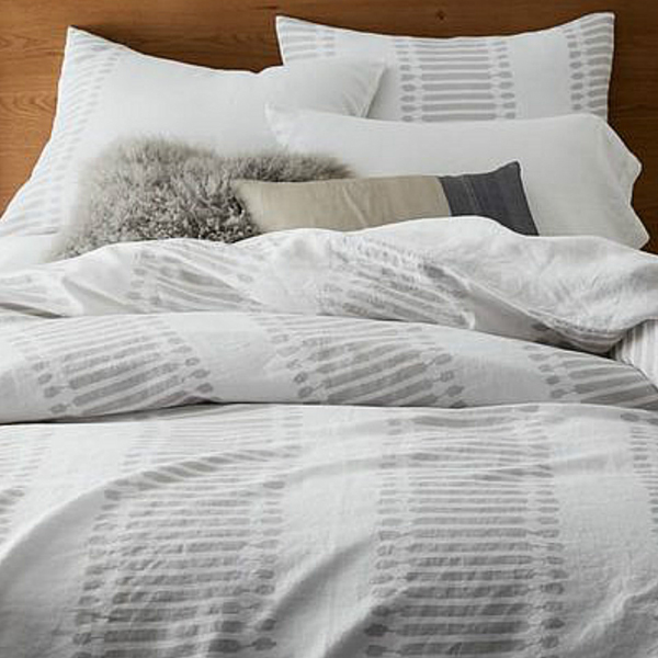
For my client’s master bedroom, I wanted a light colored duvet to help offset the navy wall behind the bed. I choose this Belgian Flax Linen Ikat Stripe bedding because the pattern is subtle and has a modern, yet traditional feel.
REPLACE DRAWER KNOBS
Replacing the knobs and pulls on your existing furniture is one of the fastest ways to give it a new look on a budget. Decorative knobs and pulls are like jewelry for your furniture, and just like the accessories we choose for ourselves, they can be understated or can make a bold statement about our style and personality. By simply updating your hardware, you can instantly help adapt your furniture to the new style you want in your room. I have a list of my favorite resources for affordable decorative knobs & pulls.
For my client’s bedroom, we chose these Twig brushed brass knobs to update the look of their existing nightstands, dresser, and chest of drawers. The brass will stand out nicely against the wood tone of the furniture, and the “twig” style is a modern twist on the outdoorsy inspiration for the room.

LAYER IN ACCESSORIES
Accessories make the difference between a room that looks nice and one that looks decorated. They add the finishing touches that give a room that layered look that makes it feel complete. It’s important to get the scale of the accessories right. People often make the mistake of choosing lots of small accessories that end up looking more like tchotchkes cluttering the surfaces of the furniture. Instead, choose a few larger accessories, and group them together for a bigger impact. You’ll see in the design plans below the groupings of vases I recommended for my client’s bedroom.
UPDATE THE LIGHTING
When updating the lighting in your bedroom, focus first on the task lighting. Choose nightstand lamps that provide enough light to allow you to see clearly if you want to read in bed, but with a soft enough light that you can still wind down and relax.
If your bedroom already has decent ceiling ligthing, then updating the general lighting is likely not a necessary expense. However, if you have room in the budget, swapping out a generic ceiling fixture for a chandelier is a great way to make a statement.
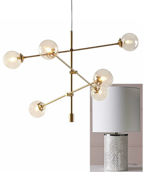
My clients wanted to update both their task and overhead lighting, so I recommended these etched table lamps and sputnik-style chandelier for some touches of glam.
CONSIDER REPLACING THE HEADBOARD
While matching bedroom sets were once considered a sign that you were a real adult, they now often feel a bit dated. Replacing just the headboard is a quick way to give your bedroom set a current look without spending too much. You can find lots of affordable options for every style, often for under $250.
My clients really wanted to add the look of reclaimed wood in their space, so I recommended swapping out the headboard. I was looking for something with a nice variety of dark and light wood – the dark to tie in with their existing furniture, and the light for contrast against the dark navy wall behind the bed. These were some of the options we considered. The first, second, and fourth were just to expensive, but options three and five provided the style we were after without busting the budget.

HOW THE PLANS CAME TOGETHER
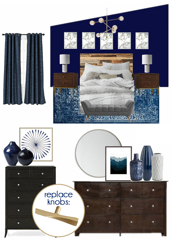
Now that I’ve walked you through the full design process, I’m excited to show you how the plans for my client’s master bedroom came together. You’ll remember that the goal for this room was to incorporate the homeowner’s love of the outdoors into a modern and sophisticated space with a cozy vibe. The full source list is below the renderings.
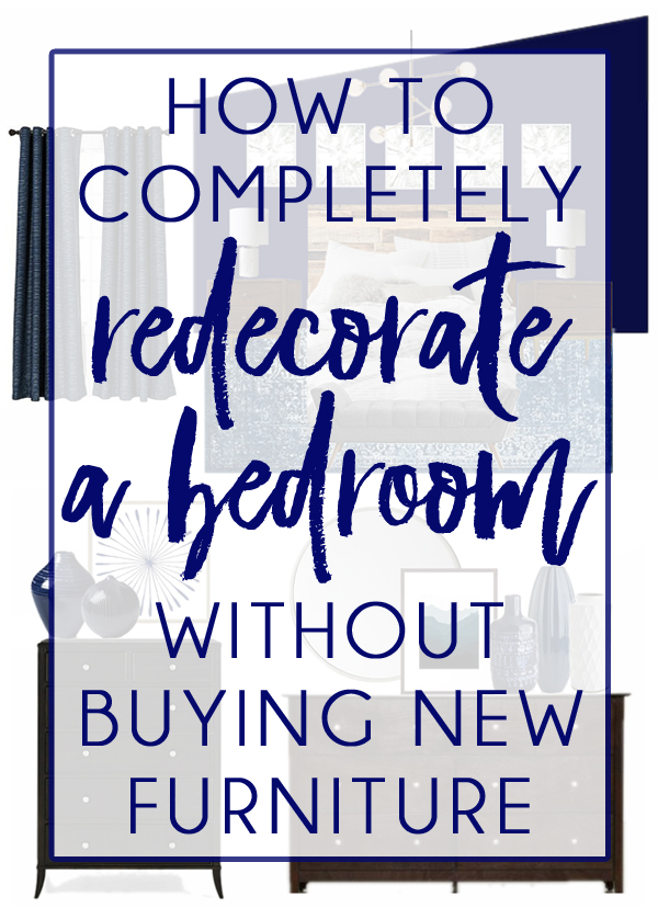
The bed will be relocated to the angled wall, which will be painted navy blue. The existing nightstands will flank the bed with new lamps, and the bed will get a new reclaimed wood headboard and simple gray and white bedding. Five identical aspen photos will hang in a row above the bed, and a new chandelier will add additional light and a touch of glam style. Since we couldn’t fit a chair into the space plan with all of the existing furniture, we instead opted for an upholstered bench at the end of the bed.
We’ll give the homeowner’s bedroom furniture a new look buy replacing the drawer knobs with new brass twig-inspired hardware. Rather than a traditional full-size mirror above the dresser, we went with a round mirror offset to one side for an updated look. Navy and white art and textural vases in navy and white will add layers of style to the space.
SOURCE LIST FOR DESIGN PLANS
