This post contains sponsored and affiliate links. If you buy something that I recommend, you pay the same price, but I may receive a small commission.
Just a few thank yous before I hit you with picture overload. First, I have to thank Linda, from Calling it Home, for hosting the One Room Challenge! Twice a year this awesome design event drives me to create a beautiful and bold new space in our home, and it’s so fun doing it along side an amazing group of fellow designers and bloggers who encourage and inspire each other to reach the finish line!
I also have to give a HUGE thank you to each of my One Room Challenge sponsors, without whom this room would not have been possible: Lamps Plus, Home Right, Minted, and Cement Tile Shop! It’s an honor to partner with such wonderful companies!
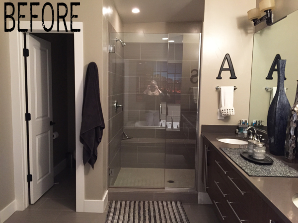
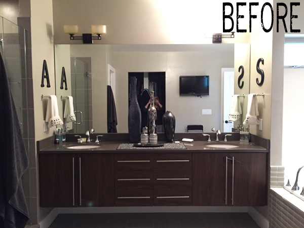
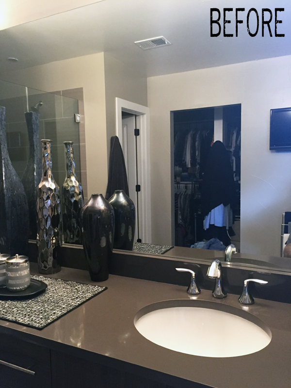
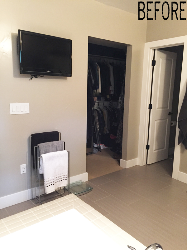
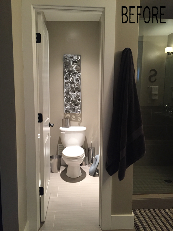
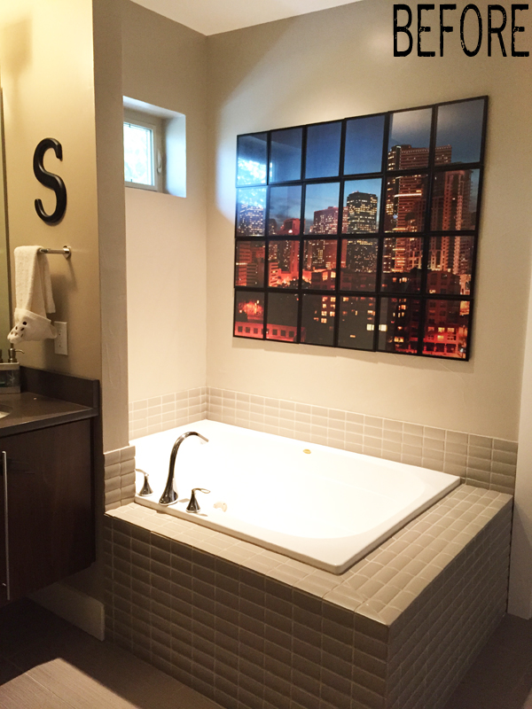
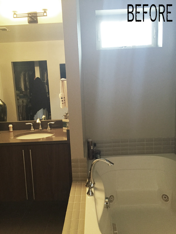
Let me remind you what this space looked like in week 1. It was fine, but a bit of a bore and very, very beige.
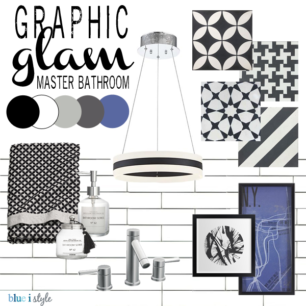
This was the mood board I created to get our plans on track…
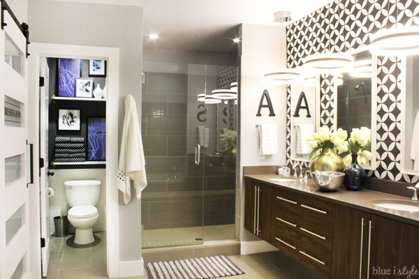
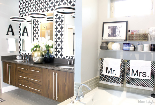
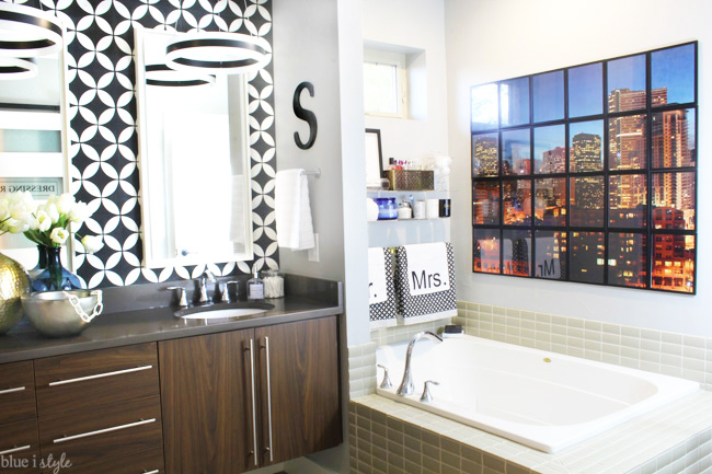
And now, welcome to my graphic glam master bathroom…
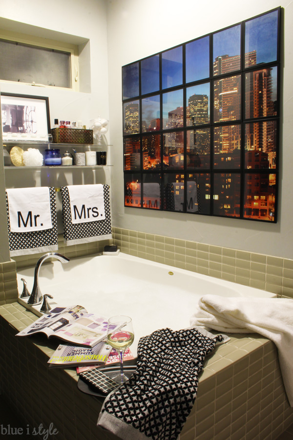
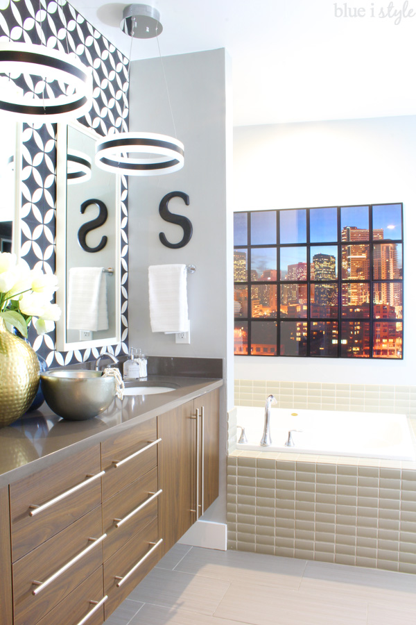
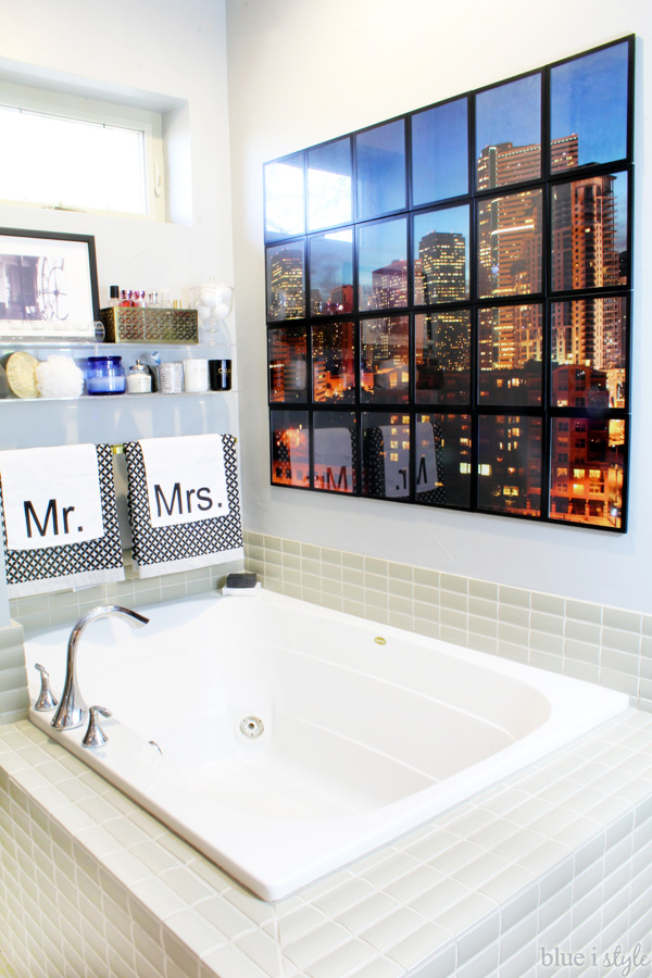
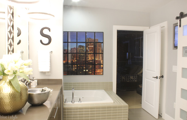
Before moving to our current house 9 years ago, we lived on the 10th floor of a downtown condo with a pretty awesome view of the Denver skyline. When we sold that condo, the city view was definitely the hardest thing to give up, so a few years ago we decided to recreate it on the bathroom wall as a giant photo mural above the tub.
The mural was one of the only parts of the old bathroom design that I really wanted to keep, but since we had to take it down to paint the walls {Benjamin Moore Metropolitan Gray is the new wall color}, I decided to come up with a better way to rehang the mural {since the last time was a pain in the rear, and always a little crooked}. This time around the mural took less than 20 minutes to install and it’s darn near perfect! I even took a video to show you how I did it, which I’ll be posting soon.
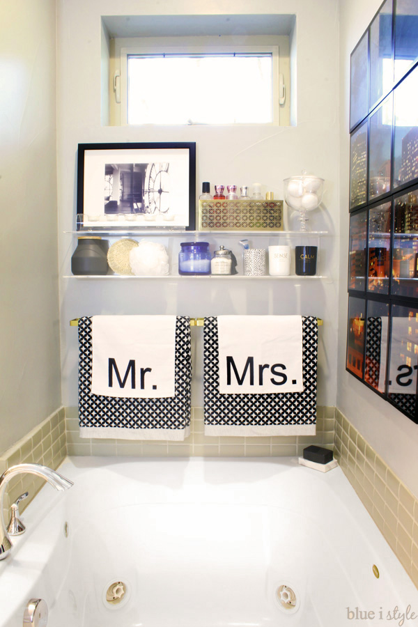
The smaller wall at the back of the tub was just wasted space before, and I was always stacking bath items on the narrow corners of the tub.
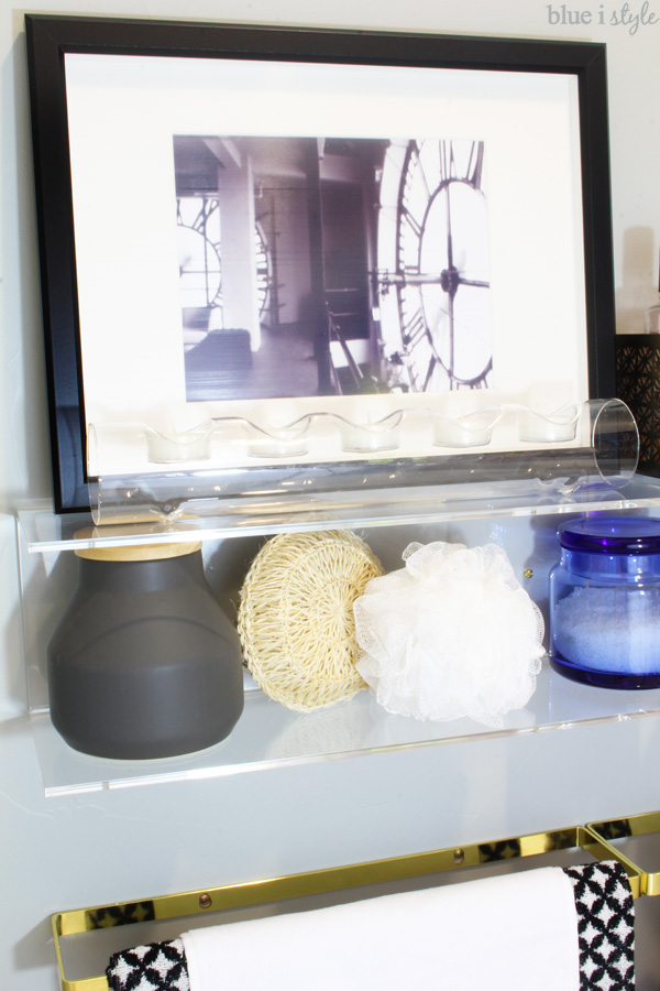
I always envisioned some kind of shelves for bubble bath and candles, but it turned out even better than I imagined.
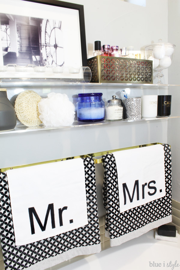
I’ve been itching to add some brass and acrylic to a room, and this little nook turned out to the perfect space for both! I installed two 18″ brass towel bars side by side, with two double acrylic shelves above them. The black and white patterned bath towels and the Mr. and Mrs. hand towels are all from H&M Home.
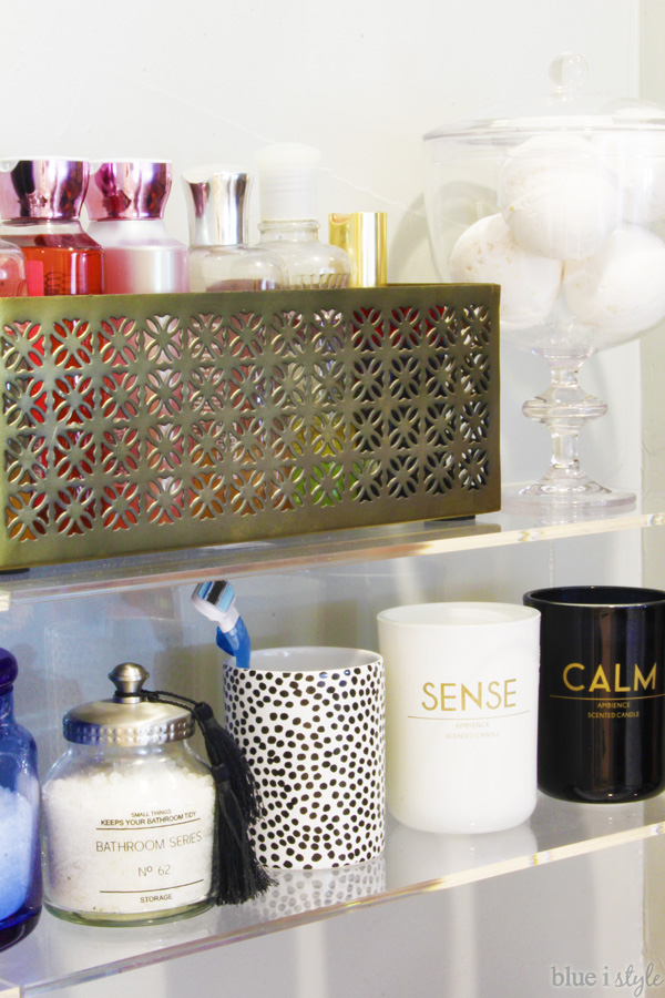
I have quite a few bottles of bubble bath, but wanted to find a nicer way to display them than just sitting them on the shelf since the colors and labels don’t match well. I found a pretty, gold metal storage box that was just the right size to hold six bottles of bubble bath and bath gel. For my bath bombs, I bought an inexpensive acrylic apothecary jar. Bottom shelf sources: blue glass jar; glass jar with lid and tassel; spotted cup; SENSE candle; CALM candle.
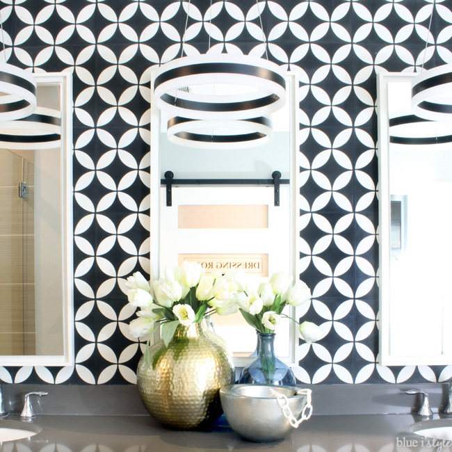
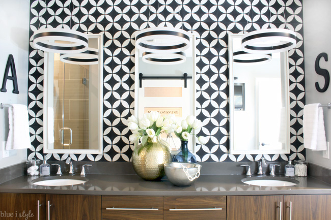
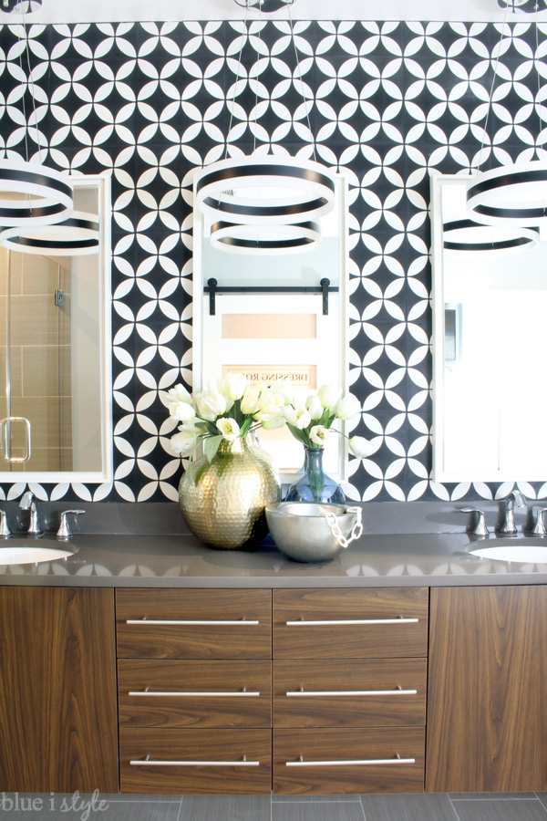
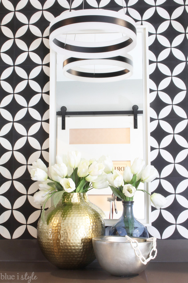
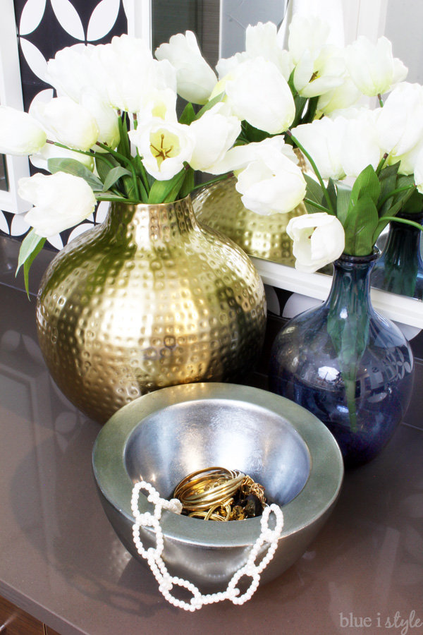
And that brings us back around to my FAVORITE part of the room. That dreamy black and white graphic wall above the bathroom counter!
Next to each sink hangs a white striped hand towel with our initials above {we’ve had the letters for years, but Michael’s currently has a huge assortment}.
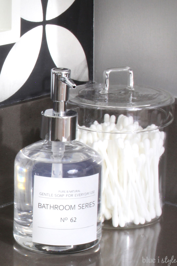
I updated our old soap pumps and washi tape striped canisters with prettier, yet super affordable replacements. Sources: soap pump; glass canister.
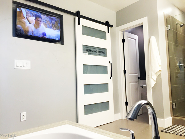
I haven’t shown you any close ups the shower, because it’s not much to photograph, and we didn’t make any changes to that corner of the bathroom. The shower has the same tile as the floor, a long bench, two shower heads, and a great view of the whole room. Here’s what you see looking out through the glass door of the shower {when the closet door is closed, the shower has a direct line of sight to the TV as well}.
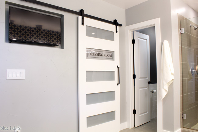
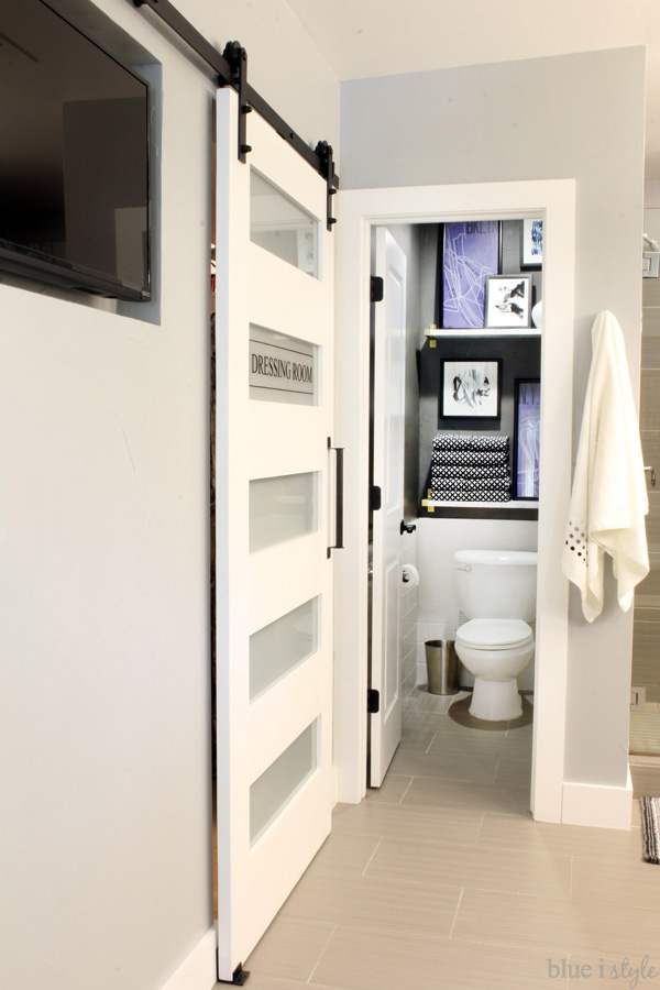
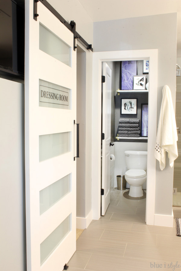
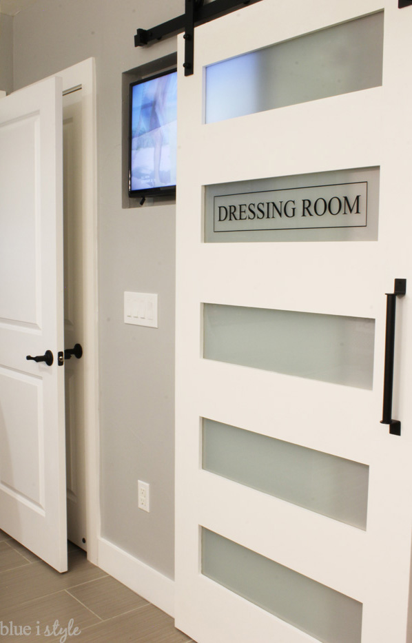
The one thing I haven’t talked about yet is the lettering on the closet barn door. I’ve pinned lots of similar glass pantry and laundry room doors over the years, so I wanted to come up with something fun for the closet door. Finally it came to me – “Dressing Room.”
In my mind, I was thinking of a dressing room at a fancy boutique. When I shared the idea with my husband, he responded that he loved the nod to his theater career. I had to laugh because I honestly hadn’t even thought of Dressing Room in that context, even though it was such an obvious connection. But I love that it’s a little something for both of us.
I really enjoy taking long baths, but I always hated that I had to look straight into the messy closet, which was not super relaxing. I suppose it really it should have motivated me to better organize the closet, and I will eventually, but adding a door seemed like the better option.
If you’ve been following along closely throughout the course of the One Room Challenge, you may notice that there are a few of things that didn’t make it in to this space. First, I had wanted to change out the faucets to a more modern style. New faucets didn’t make the cut in the budget, but I actually think the current faucets {that previously felt to traditional for our modern house} actually fit pretty well with the new glam elements in the design.
I had also talked about adding a candle chandelier above the bathtub, but I ended up deciding that corner of the room had enough going on, and worried that the hanging candle holders would make it feel too busy.
Finally, last week I asked for opinions on which large rug I should buy for the middle of the bathroom. I picked option D, but when it arrived, the colors were not as they appeared online! Instead of light gray, charcoal, white, and light beige, the rug was dark beige and brown. Totally not right for the space. I went back to reconsider the other three options, but I couldn’t get on board with a mostly white rug in a bathroom {I knew I’d regret it the first time I dropped a makeup compact}, and the reviews of the chevron-ish rug said it was black and dark beige, rather than white-ish. So none were quite right.
I actually picked up an alternative rug for only $20 at IKEA, but in the end I thought it was just too dark. In the end, I opted for no rug rather than the wrong rug, but may still add one in the future if I find something perfect.
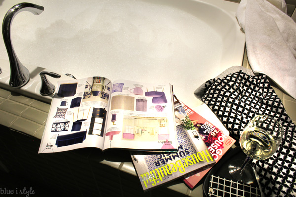
Now that I can finally call this space DONE, if any one needs me, this is where I’ll be…
Just me, my bubbles, my magazines, my Friends reruns, my view of Denver, my glass of Asti. One happy girl right here!
Thank you guys so much for checking out our new master bathroom, and thanks for all of the encouraging comments over the past six weeks! Be sure to head over to Calling it Home, where you’ll find links to all of the other One Room Challenge room reveals!
Over the next few weeks {or maybe months} I’ll be sharing some tutorials and many more details about this space, including my super fast new painting trick, how I hung the photo mural in under 20 minutes, how to create DIY faux marble shelves, and everything you need to know if you’re thinking of installing a barn door.

 JavaScript is currently disabled in this browser. Reactivate it to view this content.