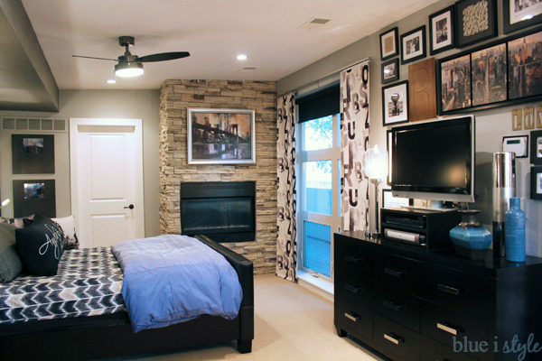
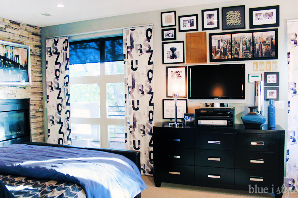
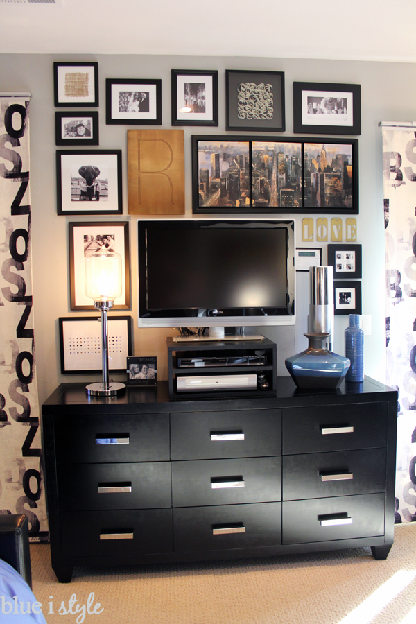
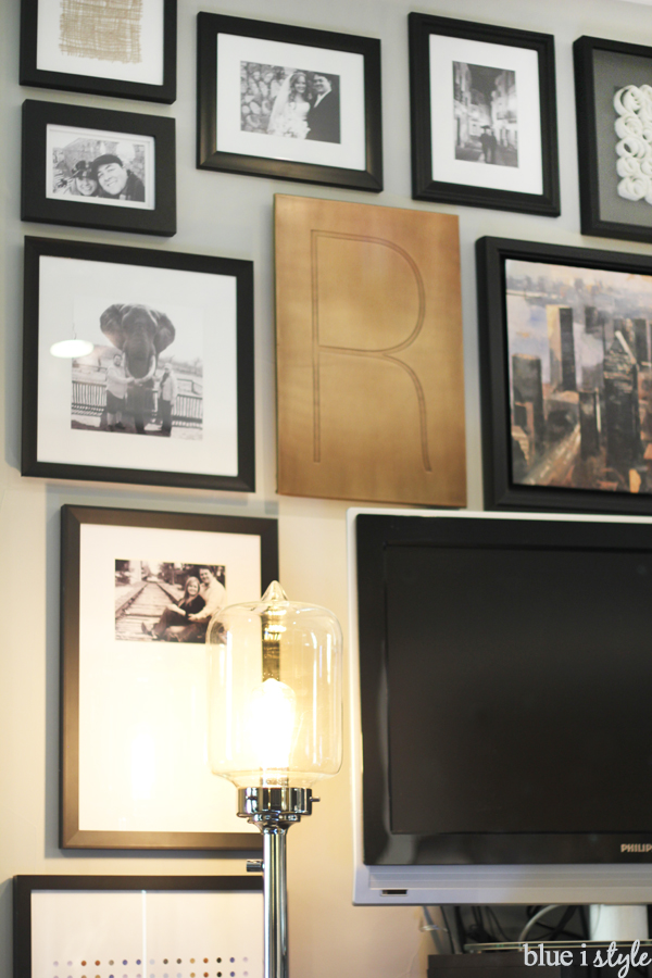
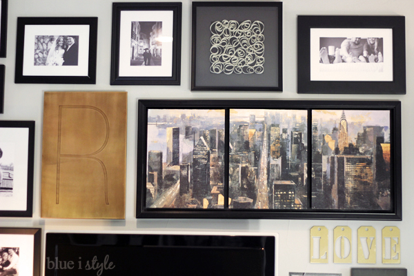
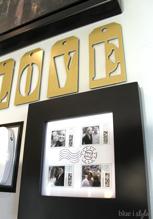
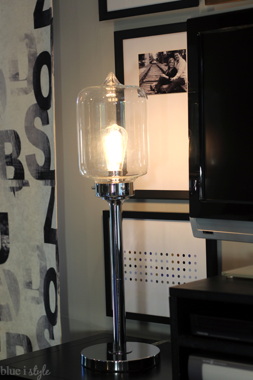
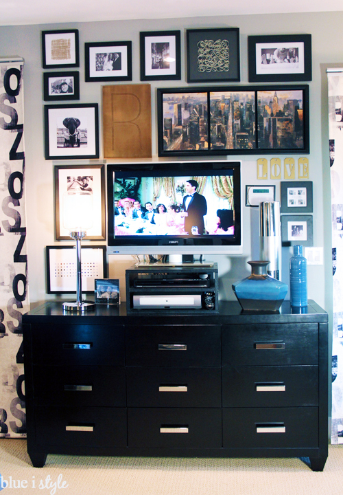
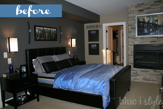
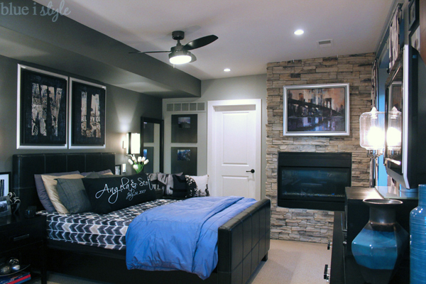
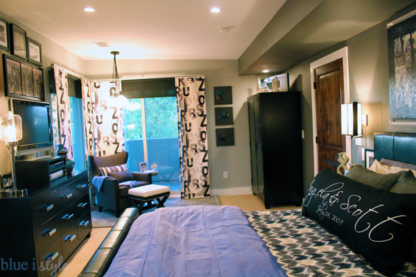
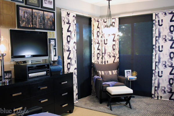
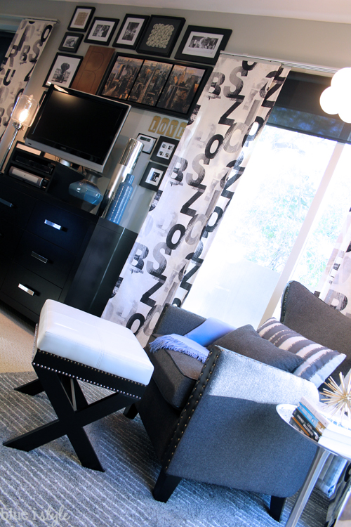
The painting that hangs immediately above the tv used to be above our bed. The scale wasn’t right in its prior location, so I relocated it and incorporated it into the gallery wall. To tie in the beige and golden tones of the painting, I added the large brass R as well as a few touches of gold.
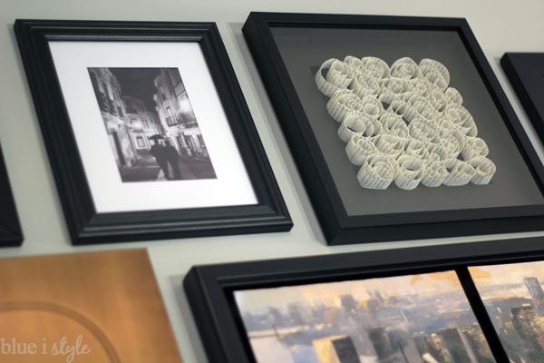
I wanted the gallery wall to be a mix of art and photographs, but I didn’t have the budget to purchase any more art, so I made my own. I found three pieces of art that I loved at West Elm, and then set about creating my own versions to get the look for less {much, much less}. The book page spiral art was one of these three projects {you can read about the others here}.
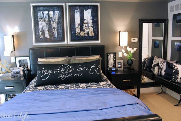
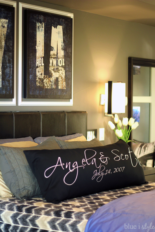
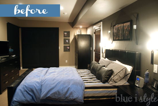
The pillow on the bed is really special to us because it is made from our wedding aisle runner. And the new coverlet was handmade by my mom from Nate Berkus fabric that I’d been lusting after for nearly a year.
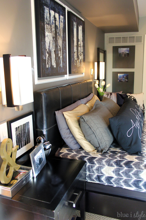
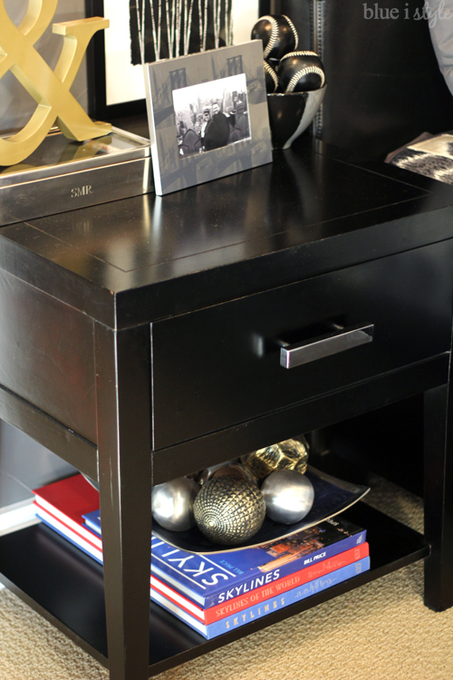
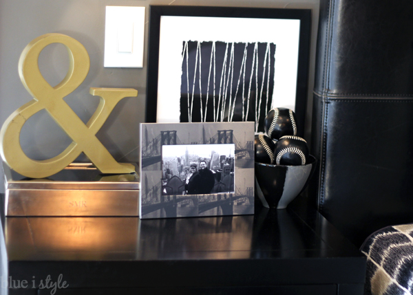
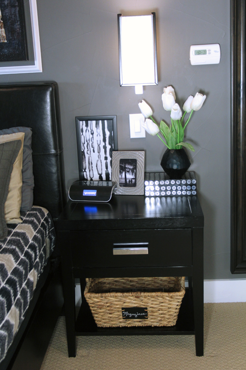
I like our wall mounted sconces, but I feel like they makes nightstand styling more of a challenge. I did a lot of experimenting and tweaking, but I finally came up with his and hers styled nightstands that I am really happy with.
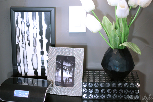
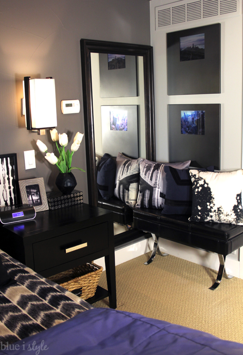
On my side of the bed, the nightstand is made more feminine by the addition of a vase of tulips, and a wicker basket on the bottom shelf now gives me a place to store my design magazines for late night reading.
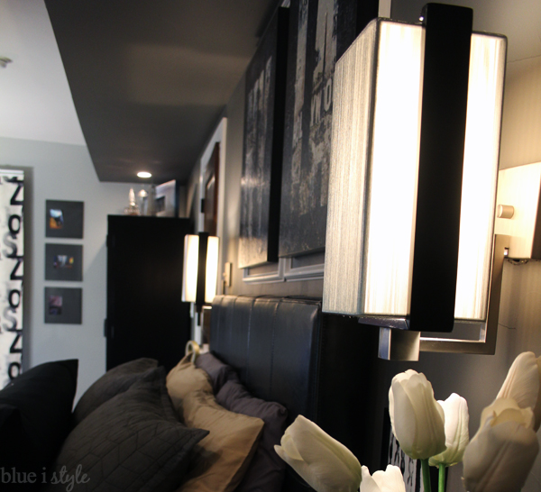
We swapped out the builder grade sconces for these silver string sconces when we first moved in, and I love them just as much today as I did on day one. They fit perfectly with the new style of the room!
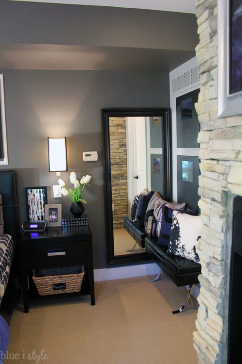
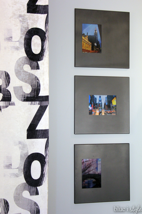
Above the bench hang two metallic finish photos of New York City. I shared the tutorial on these DIY metallic photos when I first started blogging {three more smaller metallic photos hang on the other side of the room}. During redesign process I decided I wanted these NYC photos to stay {although I did up date a couple of the pictures with ones we took on our babymoon to New York last spring}.
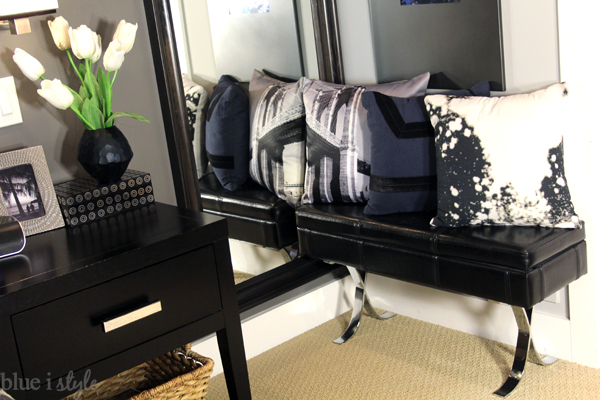
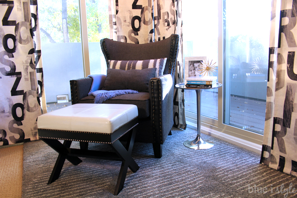
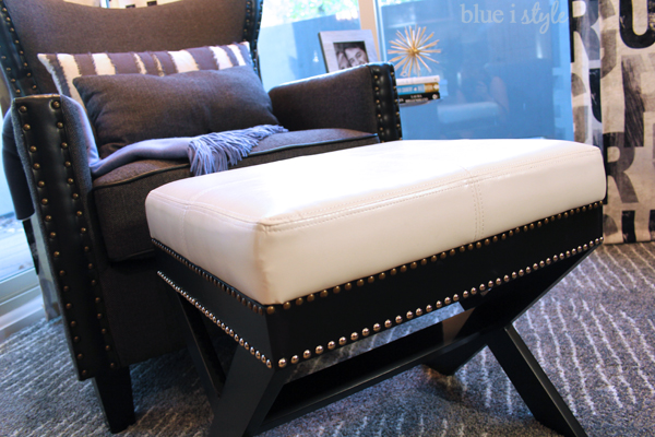
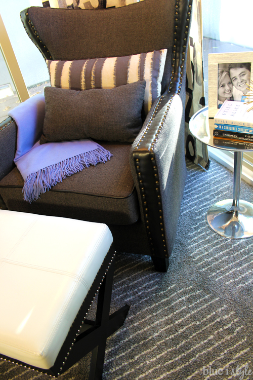
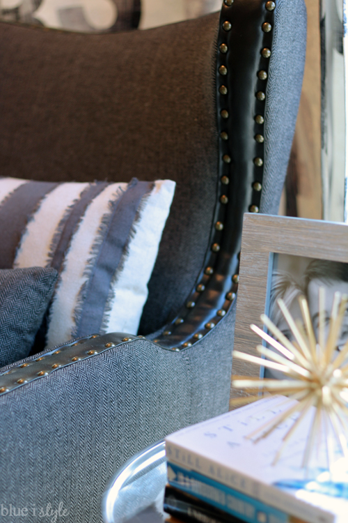
Adding the nailheads was a bit labor intensive, but the adding this detail to the ottoman cost next to nothing and really makes it look so much higher end.
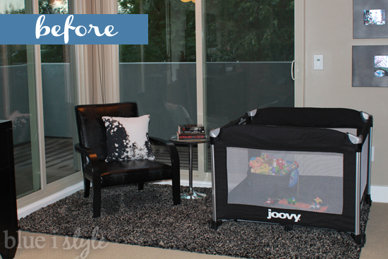
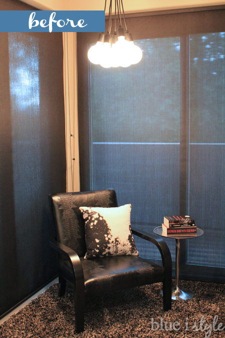
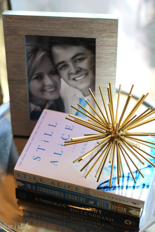
I am so excited to finally have a comfortable place to put my feet up and read {in all my spare time}. Reading for book club just got a whole lot more relaxing!
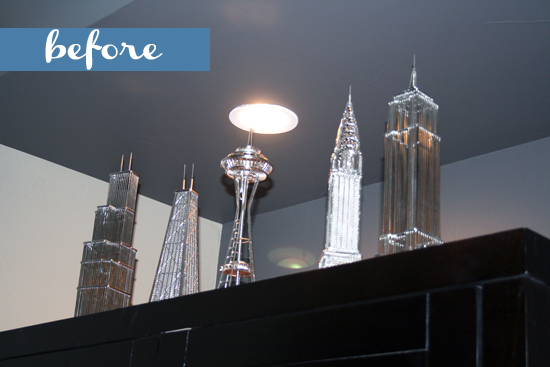
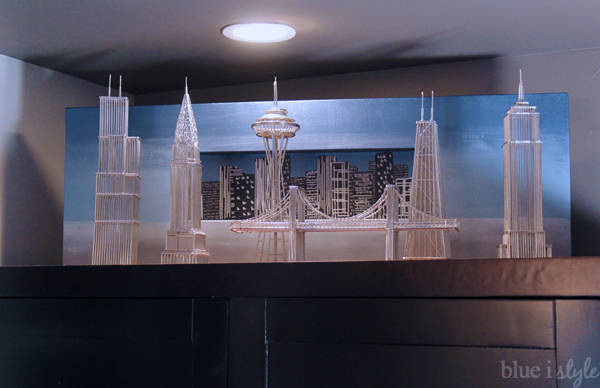
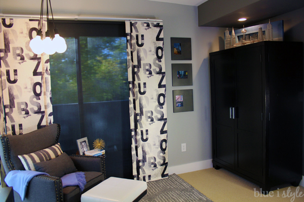
In the other corner of our bedroom is our large armoire. When we had babies in our room, I converted the armoire to baby central – with a changing station and all of the baby necessities {clothes, blankets, diapers, and swaddlers} hidden inside. Now that it is not longer needed as baby central, I have other plans for the armoire. The top of the armoire holds a small collection of metal skyline sculptures, but they were never much of a focal point.
Below is a collection of all the posts and projects in this Modern Metro Master Bedroom {more links will be added as I post additional tutorials}:
Want to see all of my other One Room Challenge projects? You’ll find theme here.
Linked up at www.remodelaholic.com, Thrifty Decor Chic
